Vicino AI
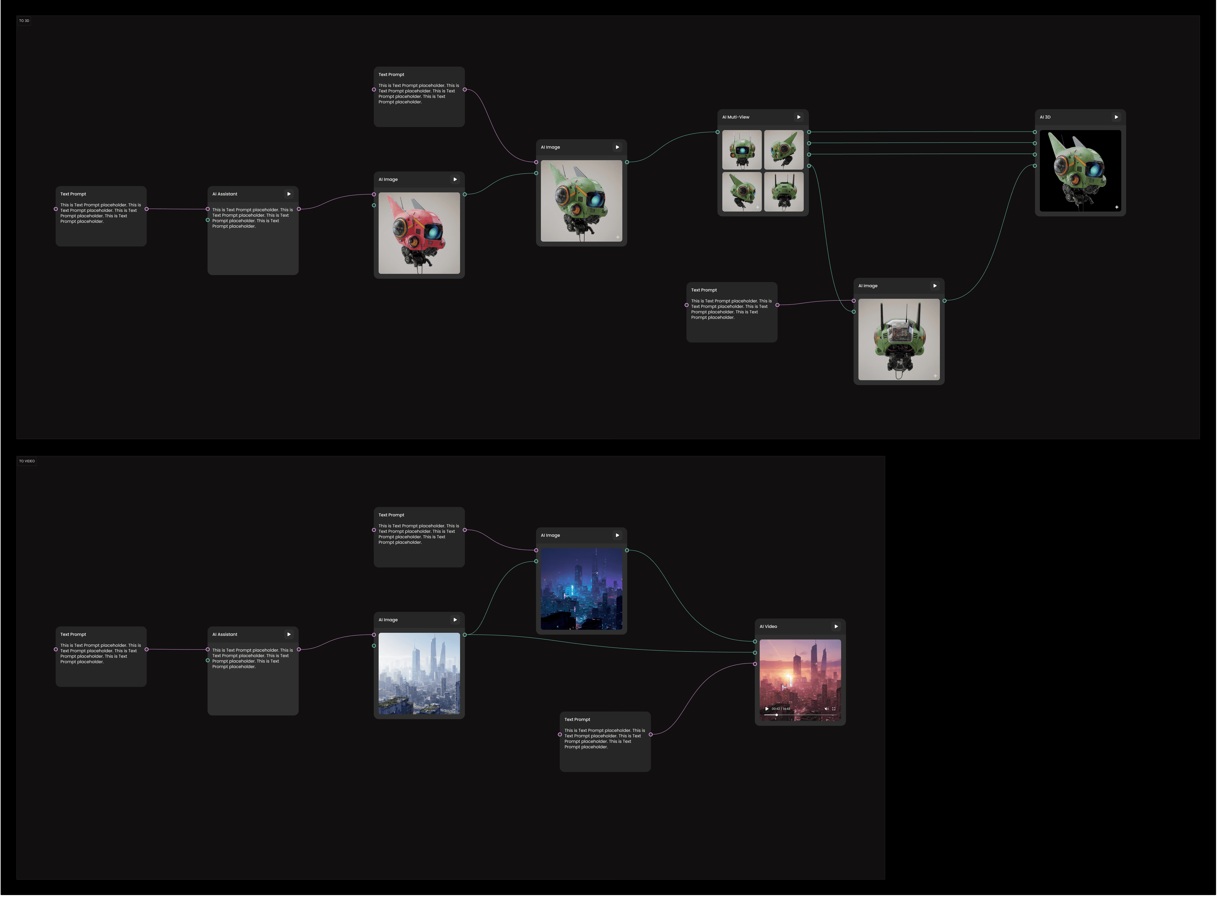
Workflow architecture for a creation canvas.
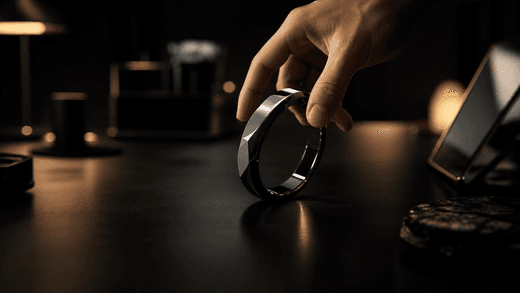
Interior studio. A figure enters frame, camera drifts from wide to close.
Close on hands at the desk; the monitor light shifts as the cut widens.
+ 4 more scenes
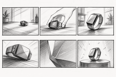
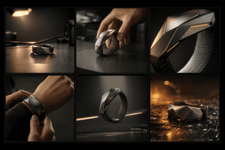
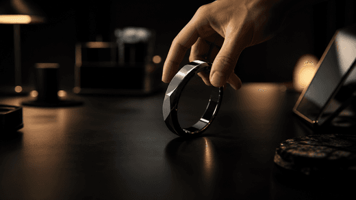
Slow push-in, 35mm. Practical warm key; hold on the hands.
At a glance
- Main path rebuilt around what models support
- Checkpoints let people inspect, redirect, decide
- One shared language for where features belong
4zones, one shared framework
01 · Overview
A canvas people could understand, correct, and continue.
The design problem was never how many tools the canvas could hold, and better models will not retire it. It is where a person can read the work in progress, shape their own intent, and know what to change next.
My role grew from screen-level design into product architecture. I worked with PMs, designers, engineers, the founding engineer, and ML engineers to clarify workflow stages, node responsibilities, editor logic, the Sidebar and Floating Bar layers, sliding panels, and the design system behind them. The core lesson was simple: new technical range only matters when people can still see what the system is doing and change its course.
The product in use
02 · Context & problem
From Raw Generation to a Workflow People Could Steer
Vicino is a node-based generative video platform — a canvas where people build generation, composition, and editing as connected nodes rather than a linear timeline. The generation power was already there; the design challenge was what came after it. As the company moved toward B2B content production, the product had to grow from a capability-first tool into a guided, controllable video workflow — one that could carry both a creative-production veteran and a marketer who had never touched an AI video tool.
When I joined, the core problem wasn’t visual polish — and it wasn’t missing editing depth; we were never trying to out-edit Photoshop. It was that the models advanced fast but stayed unpredictable, and a near-blank canvas gave so much freedom that getting from an idea to a usable video was hard to learn and easy to get lost in. The tell was in the feedback: most of it wasn’t about the interface, but about how to use the models correctly and make the output more precise — people weren’t asking where a control lived, they were asking how to steer the generation and recover when a result came back wrong. B2B raised the stakes: the audience ran from creative-production veterans to marketers new to AI video, and the product had to guide both without slowing either down.
03 · The flow
The Main Path, Built to Keep Intent Legible
I rebuilt the main path around four checkpoints, each a place to inspect and redirect before the next, costlier step. Each also asks the person to state their intent plainly, and that stated intent is the clearest prompt any model can act on: the flow does prompt-engineering by design, and teaches it as people work.
The path splits in two: the front half converges intent into language any model can read; the back half turns it into generation people can steer and refine. It’s also the step-control a future full-workflow agent would need.
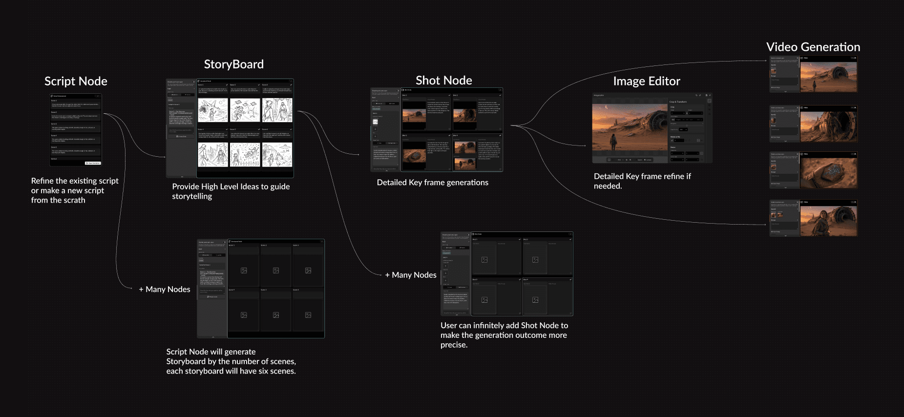
The main path, run end to end
Interior studio. A figure enters frame, camera drifts from wide to close.
Close on hands at the desk; the monitor light shifts as the cut widens.
+ 4 more scenes
Slow push-in, 35mm. Practical warm key; hold on the hands.
04 · The interface
A Designated Home for Every Kind of Function
The new workflow forced a second problem into the open: the original lightweight node could not scale to carry these bigger encapsulated nodes, and as everything piled onto the same node surface the canvas itself turned bloated. A staged workflow needed a UI language that could scale with it.
So I gave every kind of function a designated home: the Work Space stages the nodes, the Floating Bar carries the next step, the Sidebar holds global settings and model selection, the Sliding Panel takes node-level adjustment, the Node Panel stays minimal, and deep revision leaves for an Editor. Each zone keeps one rule and a list of what never goes there — so future features arrive with a place to live instead of a new structural debate.
Click the Image node — its sliding panel and floating bar collapse into it; click again to reopen themFloating Bar
Actions on the selected node — duplicate, download, and the next steps (open the editor, multi-views, make a video). Never node settings.
Sliding Panel
Node-level inputs and quick tweaks, changed in place — the prompt and its references. Not global settings or the next step.
Node Panel
Stays minimal — the output and Generate. Every other function moves off it and into a zone of its own.
Image
Work Space · recreation of Vicino’s Image node · specimen data
Node Panel
Image
Stays minimal — the output and Generate. Every other function moves off it and into a zone of its own.
Floating Bar
Actions on the selected node — duplicate, download, and the next steps (open the editor, multi-views, make a video). Never node settings.
Sliding Panel
Node-level inputs and quick tweaks, changed in place — the prompt and its references. Not global settings or the next step.
Sidebar
Image
Image nodeWhole-node settings — model selection, aspect ratio, Generate. If a control governs the node, it lives here.

When I realized the product did not need one more feature — it needed a clearer interaction model
During one review, we walked through a long creation chain: camera, 3D, image, prompt, and then video. On paper, each part was already becoming more capable. But when I tried to trace the flow from input to output, I realized the problem was no longer feature depth. The problem was that the system itself was becoming harder to explain. Even within the team, people were beginning to describe the same workflow in different ways. That was the moment I stopped treating the project as a series of screen problems and started treating it as a workflow problem.
From then on the work was mostly about where complexity should live — and both halves of this project grew out of that one question. The flow gave people a path they could follow and correct; the zoning gave every kind of function a place to belong. What I keep from it is not any single screen but a way to grow a product: when the models cannot do everything in one shot, structure is what lets people — and the team — keep moving, and lets new features enter without reopening the same debate.