Case study · UX internship · Summer 2025FrogHire.ai
FrogHire.ai
A summer of triage on an early-stage AI job-matching product — turning bug reports and one-star reviews back into user trust.
At a glance
- Three systemic flaws diagnosed under scattered bugs
- Lightweight fixes shipped within startup constraints
- Signup registrations recovered at a critical stage
~100issues logged as QA of record
The operating model
Trust was the real backlog.
I redesigned FrogHire.ai, an early-stage AI job-matching platform, turning scattered bug fixes and negative reviews into a focused effort to rebuild user trust. Through usability testing, bug triage, and competitive analysis, I found the real issues weren’t missing features but missing guidance—users had no onboarding, unclear resume states, and opaque subscriptions. By reframing isolated complaints into systemic design problems, I delivered lightweight yet impactful fixes that restored signups, improved clarity, and helped the product survive its critical growth stage.
One-star reviews and weekly bug passes
Chrome reviews, dashboard walkthroughs, subscription states, resume mismatches.
Three flaws underneath the noise
No onboarding, broken hierarchy, and missing trust became the real backlog.
Every fix met the startup constraint
Animated onboarding, subscription clarity, resume control, and filters all had to survive cost.
Small fixes kept the product moving
Tooltips shipped, filters held, partial wins still restored a path forward.
Ch. 01
I refused to just patch bugs without seeing the bigger problem.
“Hard to use.” “Confusing.”
Chrome Web Store reviews
The First Time Startup Urgency Hit Me
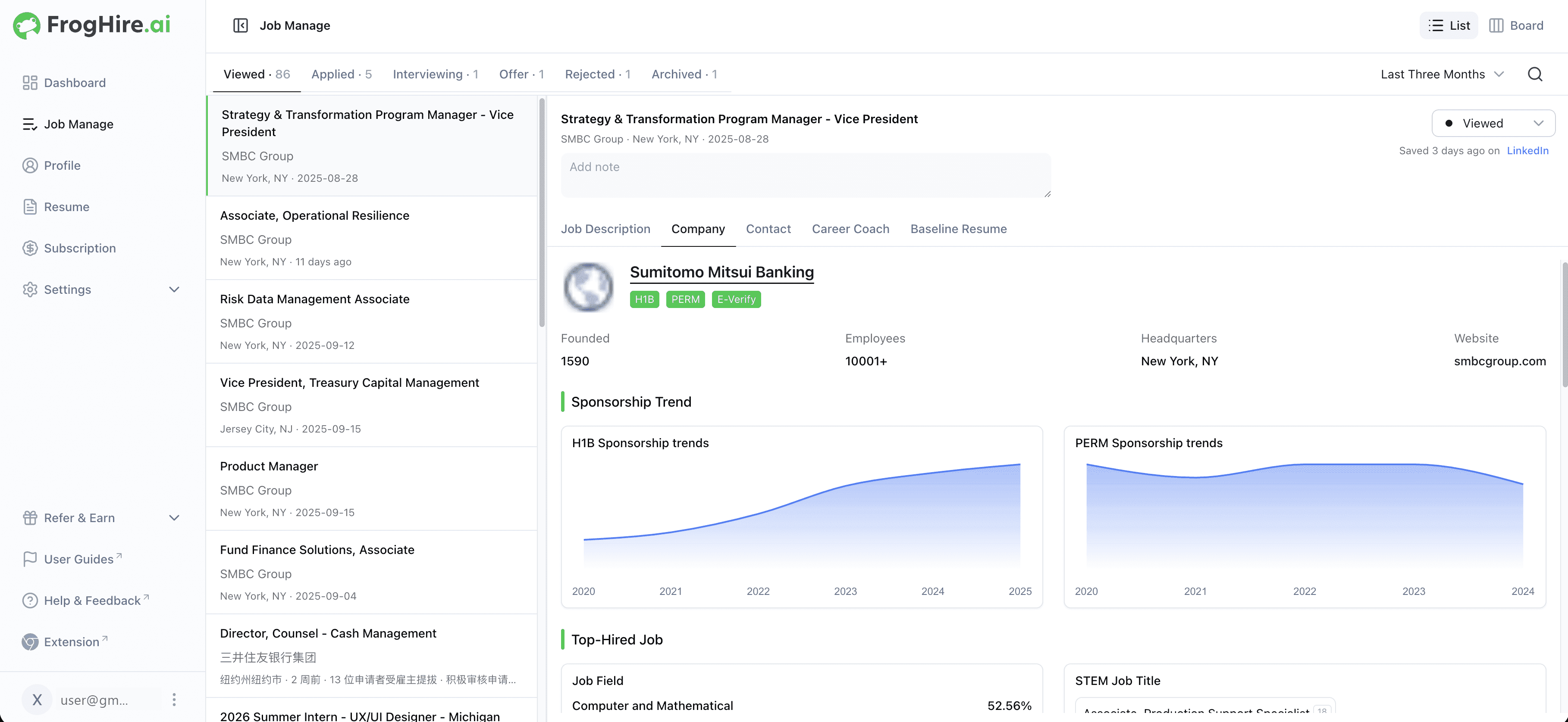
At kickoff, the PM and mentor walked us through the product. It had many features, but they felt stitched together. The CEO pulled me aside and asked me to review every page, especially the negative reviews on the Chrome Web Store.
Reading those comments, I realized this wasn’t school anymore—it was survival. No one was waiting for a polished framework; the CEO wanted metrics back up fast. That was when I felt it: design here wasn’t about ideal portfolios, but about relieving user pain immediately with limited resources.
“I honestly have no idea how to use this.”
Chrome Web Store review
Testing Showed Me Users Weren’t Lost—They’d Been Left Behind
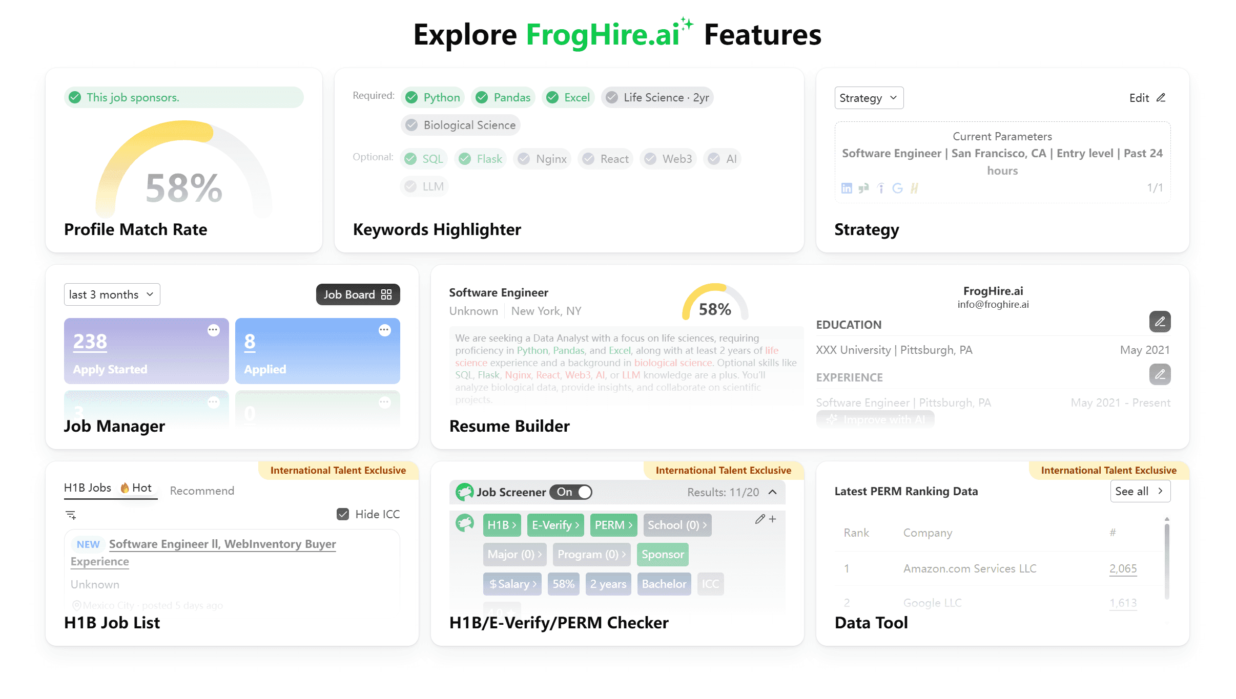
Every week I ran through the whole dashboard—subscriptions, resumes, job recommendations—logging every bug with screenshots. The problems piled up: hidden subscription flows, unclear resume states, job lists suggesting software engineering roles to marketing students.
Then one review stung more than the rest—I’d felt the same on my first try. The problem wasn’t user intelligence—it was the product’s silence. No onboarding, no guidance, no hand to hold. Users weren’t lost; they’d been abandoned.
“We’re past early funding. Every design decision must make financial sense.”
My mentor
I Learned That Chasing Trends Wasn’t an Option
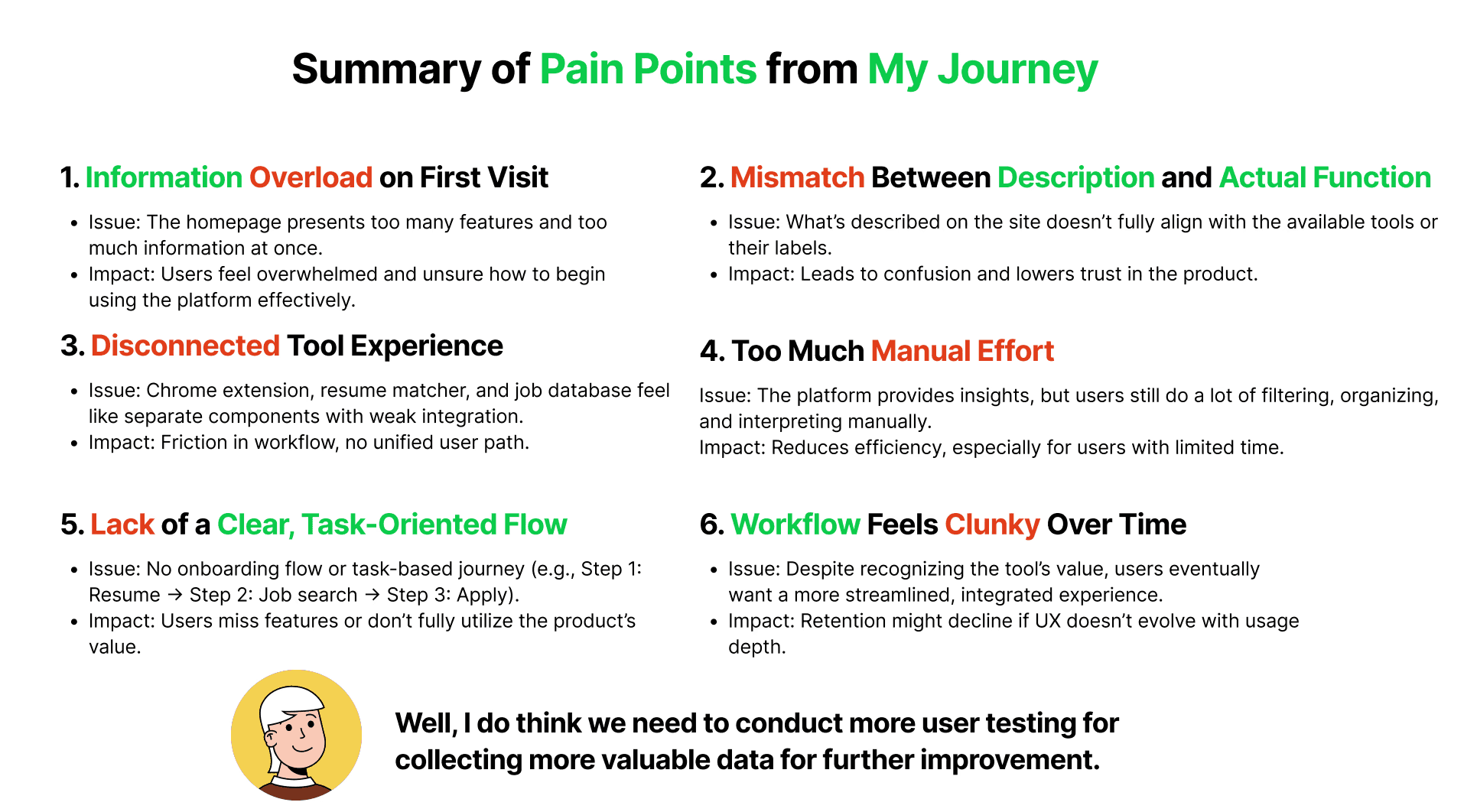
My mentor showed me Simplify, Teal, and other competitors. They had sleek AI autofill features, and at first I thought we should too. But once we calculated costs, it was clear a startup couldn’t afford that.
That reframed my mindset. Startup design wasn’t about piling on flashy features, but finding leverage points—low-cost changes that could restore trust and usability. It wasn’t about chasing the AI trend; it was about knowing what not to build.
From Scattered Bugs to Systemic Problems
Together with my mentor, I clustered bugs and feedback. Resume gaps, opaque subscriptions, scattered settings—they all pointed to systemic flaws: no onboarding, broken information hierarchy, missing trust.
At first it felt like whack-a-mole: fix one bug, another pops up. But then it hit me: unless we asked bigger questions, users would keep leaving faster than we could patch. Why was conversion so low? Why were features ignored? Did users lose trust on day one?
That was my turning point. I wasn’t just logging issues anymore—I was learning to turn bugs into design problems. That’s where design could shift the product from firefighting toward strategy.
Hover a complaint to trace it to a flawTap a complaint to trace it to a flaw
Ch. 02
When Ideal Designs Collapsed, I Learned to Deliver What Survives
“This will impress users the most.”
The CEO, on the animated demo
The First Lesson in Startup Compromise
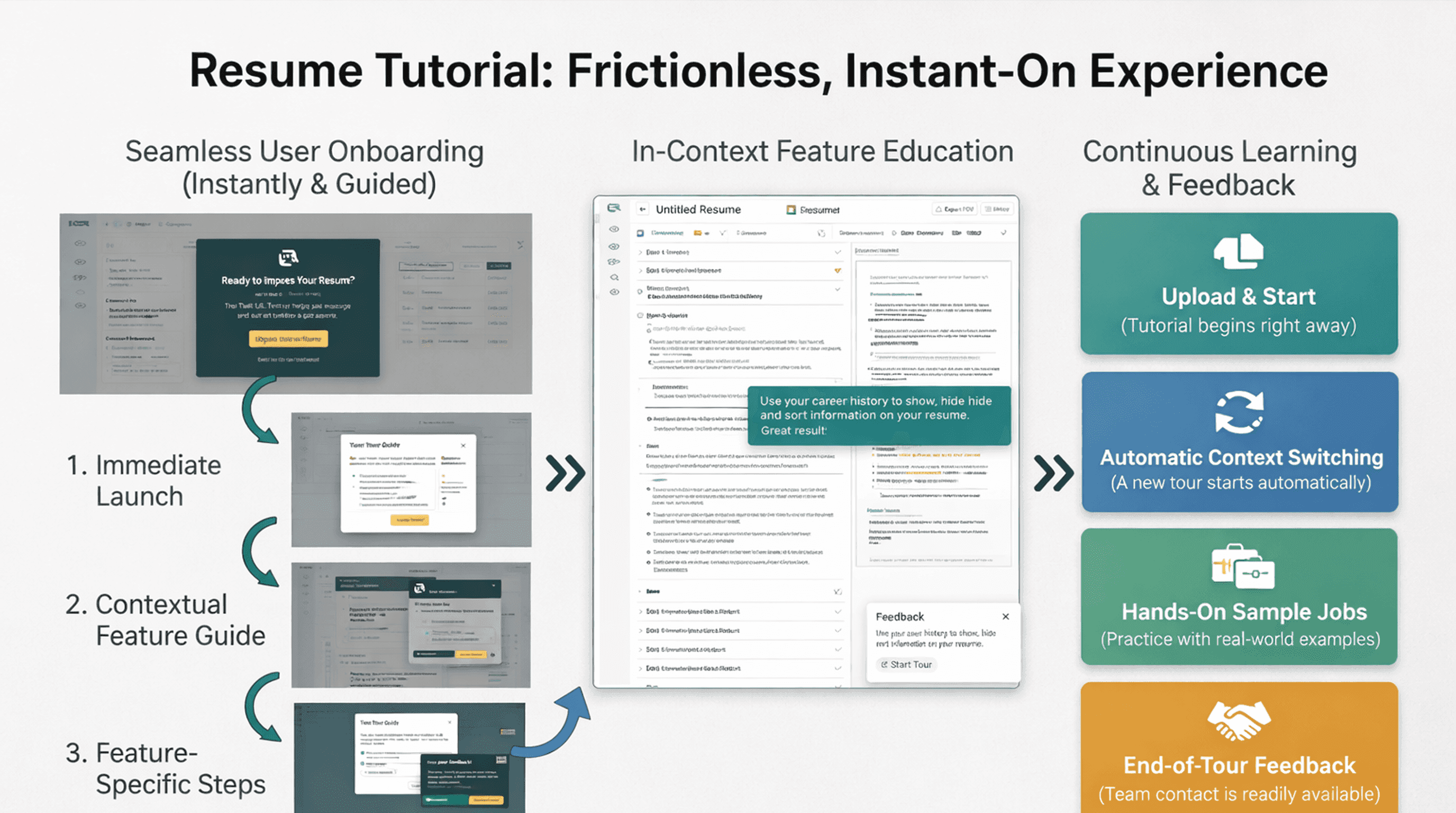
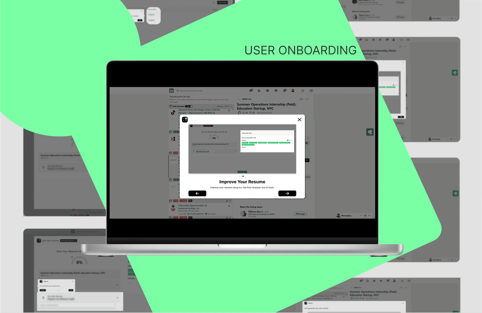
I drafted three onboarding flows: pop-ups, a walkthrough, and an animated demo. The CEO immediately pushed for animation. Honestly, I felt a spark too—it looked more “designed.”
But engineering shut it down flat, and my excitement dropped instantly. If users had no onboarding at all, even the flashiest animation meant nothing.
Then my mentor cut in with the line that reframed the whole standoff: we’d been debating how, when the real problem was whether.
And that was my first real startup lesson: elegant ideas rarely survive—the designs that ship are the ones that matter.
Fighting for Clarity, Accepting Half-Wins
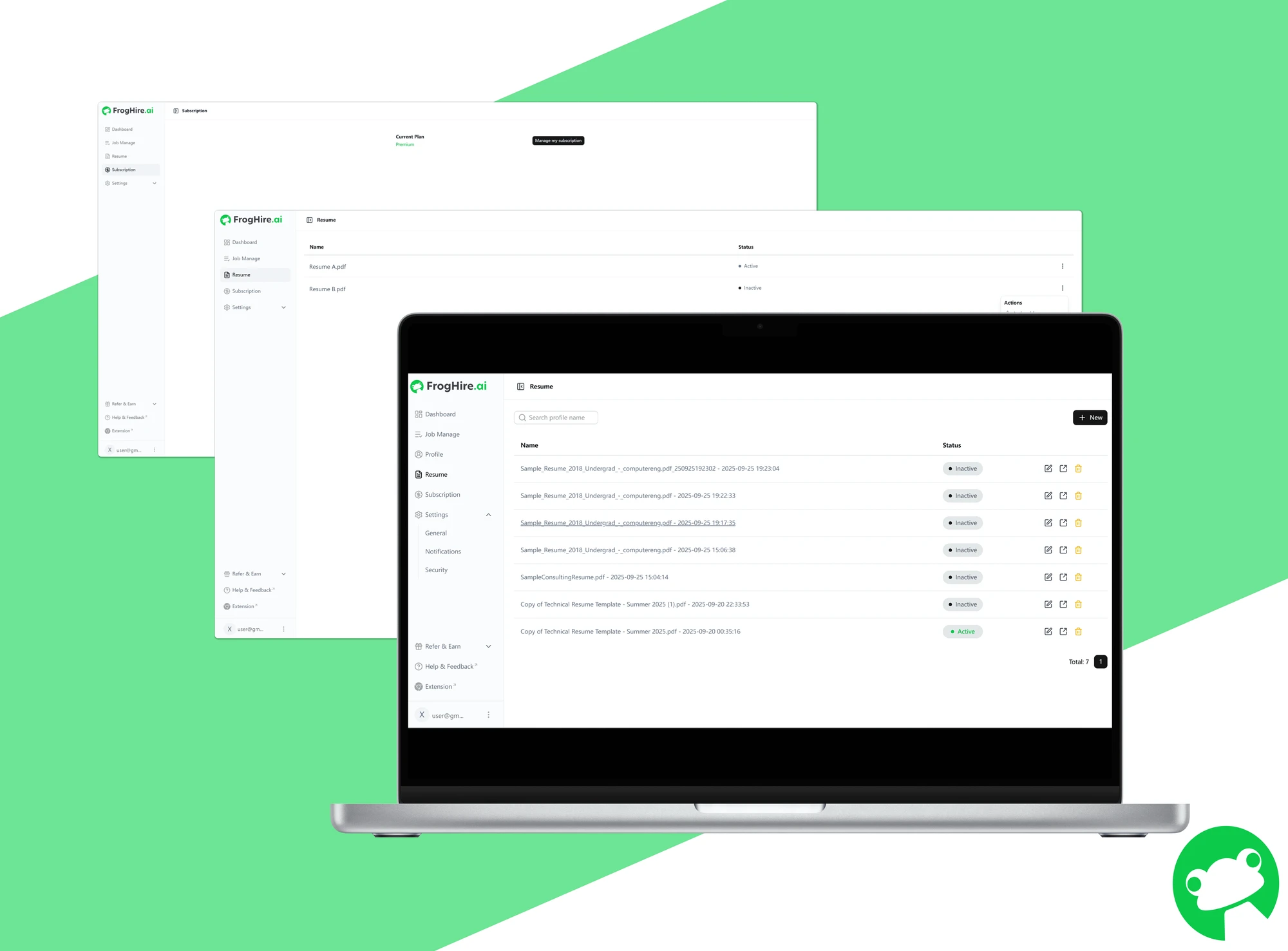
Subscription clarity, resume control, filters—every redesign that summer went to the same bargaining table, and each round closed differently.
Each round felt like bargaining. Sometimes I won clarity, sometimes only half. But I learned to prioritize: if the perfect solution won’t ship, even a partial step forward is still progress.
“We thought that feature wasn’t live yet.”
An engineer, mid-QA
Becoming My Own QA
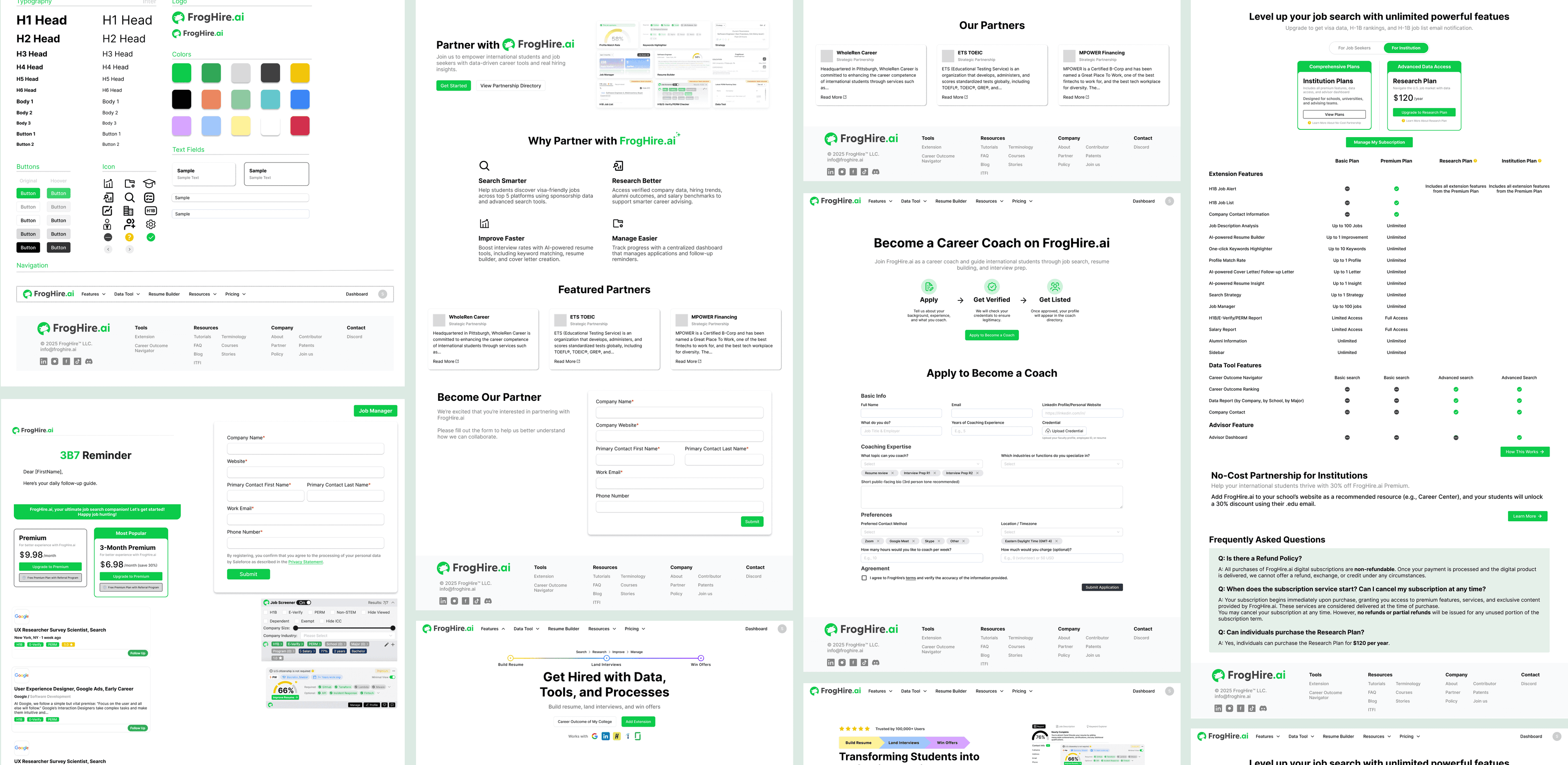
After handoff, the frontend often ignored our Figma components and used their own templates. When I saw the first build, I froze: the structure was right, but the details were unrecognizable.
So I became my own QA—running every flow, screen-recording, capturing bugs. Subscription data missing, resume states broken, misaligned tooltips—I logged nearly a hundred issues. One engineer’s mid-QA admission was both funny and painful.
Frustrating as it was, I learned something essential: in a strapped startup, the designer isn’t just a flow creator—they’re also the last line of defense for what makes it to production.
“We’re still firefighting. Eventually we need standards.”
My mentor
From Frustration to Redefining My Role
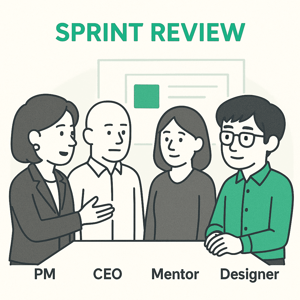
In review, the PM said at least registration rates had recovered. The CEO called a demo “complete,” even though its value was limited. I felt torn—by their definition, we’d succeeded. But I knew this “completeness” was fragile.
Then my mentor said the line that stuck with me all summer. Yes, we were living in trade-offs. But I could still fight for clarity and consistency where it mattered.
That’s when I reframed my role. Design wasn’t just about pixels—it was about helping the product survive and move forward, even if imperfect. In a startup, sometimes keeping the product alive is the most meaningful design you can deliver.
Ledger
Every fix was a negotiation.
Onboarding
Lightweight tooltips — far from perfect, better than nothing.
ProposedThree flows drafted: pop-ups, a walkthrough, an animated demo. The CEO pushed for animation.
Pushback“It would slow load times and push release back two weeks.” — engineering
Subscription
Price only.
ProposedA subscription page showing price and timeframes.
Pushback“Too heavy for the backend.” — engineering
Resume states
One highlighted resume — a little control, not flexibility.
ProposedActive / inactive toggles to control recommendations.
PushbackToo complex — engineering said no again.
Filters
Location and salary filters, in full.
ProposedLocation and salary — what mattered most to job seekers.
PushbackPushback again. That time, I didn’t fold.
What survived
Registration recovered, and the product kept moving. The ledger closed mostly in half-wins — only the filters shipped whole. A half-win that ships, I learned, still counts.