Roper Center
Redesigning Campaign Weathervane — the Roper Center’s teaching simulation built on decades of real archived polls — from quiz-like clicking into structured learning.
At a glance
- Heuristic audit and student testing exposed hollow progress
- Progress bar rebuilt as comprehension checkpoints
- Citations reframed as rewards students actually open
4design principles, from testing
01 / The brief
The tool measured activity, not comprehension.
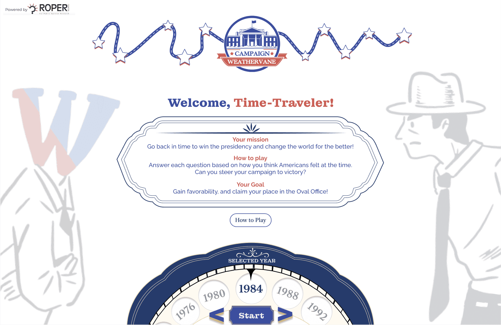
I led the redesign of Roper Center’s educational simulation platform, reframing it from a confusing quiz-like tool into a structured learning experience.
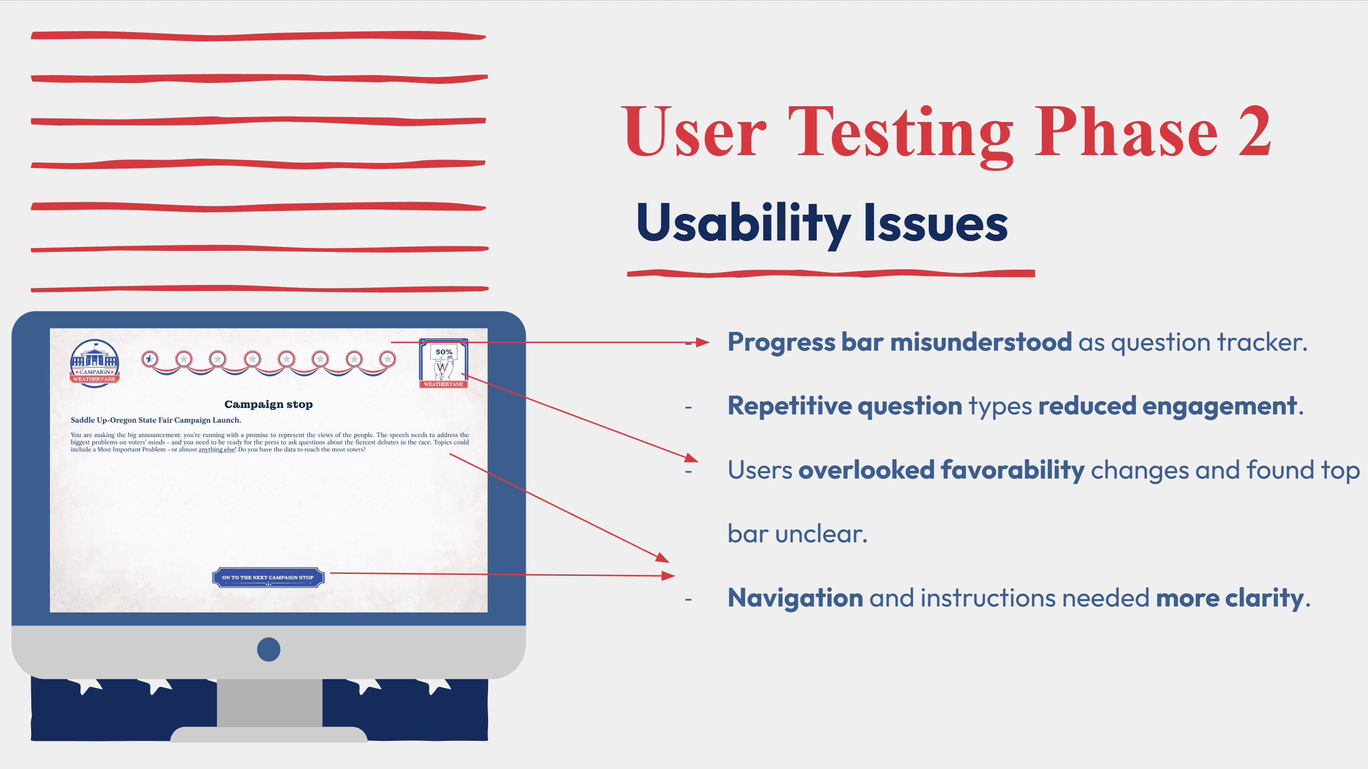
I uncovered systemic issues through heuristic evaluation, competitive analysis, and user testing: unclear navigation, misleading progress bars, and a lack of educational alignment. By translating pain points into design goals—clarity, feedback, motivation, and learning outcomes—I rebuilt the simulation so progress finally meant comprehension.
02 / Guess vs. America, 1984
The game asks one honest question: what did America think?
The product’s core loop, rebuilt in this page’s own ink: read a real question from the archive, commit to a guess, then meet the number America actually gave. The figures below are the prototype’s own sample question — proof of progress a student could believe in.
“On the whole, do you favor or oppose most of the efforts to strengthen and change the status of women in society today?”
drag the marker, release to lock your guess — then see what America saidYour guess 50% · actual 80% · off by 30 pts
The prototype’s sample question · National adult · registered voters (77%) · fielded 9/7 – 9/11/1984
03 / What the audit found
Three passes over the same tool, one verdict.
01
The Kickoff That Looked Like Learning but Wasn’t
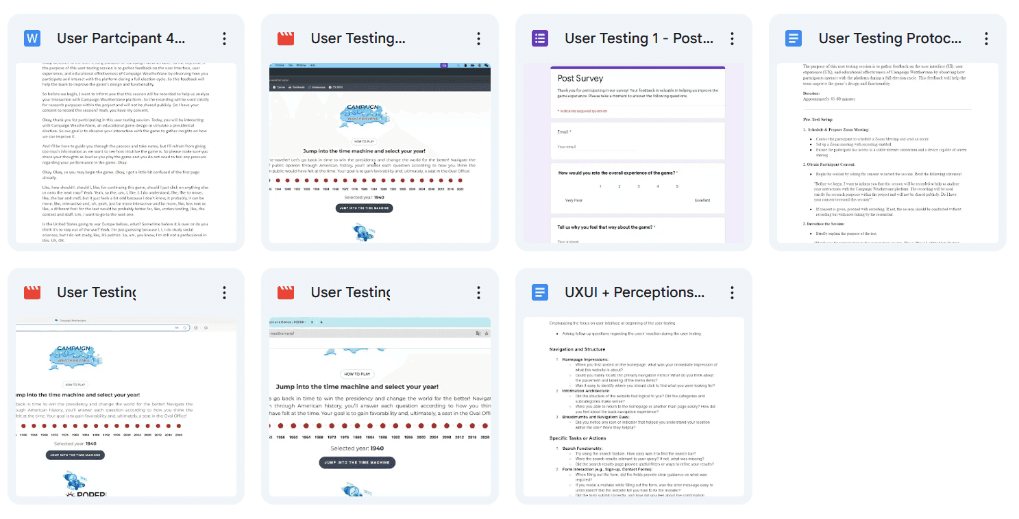
The Roper Center came to us with an educational simulation tool that looked like a quiz game. Students could click through questions, earn points, and see progress bars fill up. On the surface, it felt like learning. But in kickoff discussions, faculty admitted: “Students play, but they don’t retain.” My first realization was that this wasn’t about polishing visuals—it was about uncovering why “fun” wasn’t translating into knowledge.
02
The Audit Promised Usability but Revealed Deeper Gaps
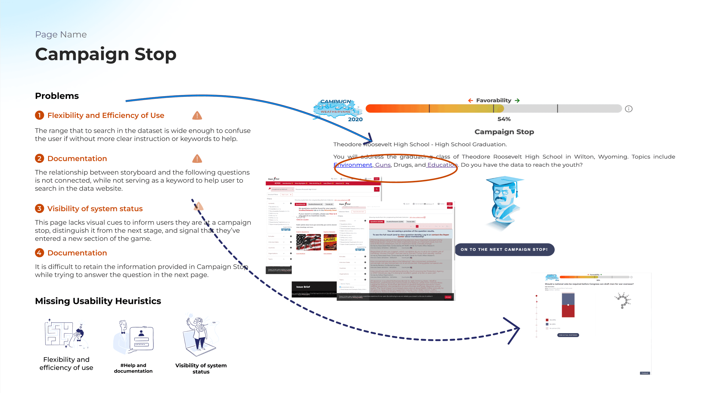
I started with a heuristic evaluation. What I found was subtle but serious: ambiguous navigation, misleading progress indicators, and no cues linking actions to learning outcomes. A progress bar suggested mastery, yet no feedback confirmed understanding. These issues weren’t just usability flaws—they revealed a deeper problem: the system measured activity, not comprehension.
03
When Points Felt Hollow, Students Asked for Proof
User testing with high school and university students reinforced this gap. Many completed tasks quickly, but when asked to recall citations or explain reasoning, they hesitated. One student put it bluntly: “It feels like a game, not like I’m learning.” That insight reframed our challenge: the design goal was not to keep students clicking, but to give them proof of progress they could believe in.
04 / Four principles
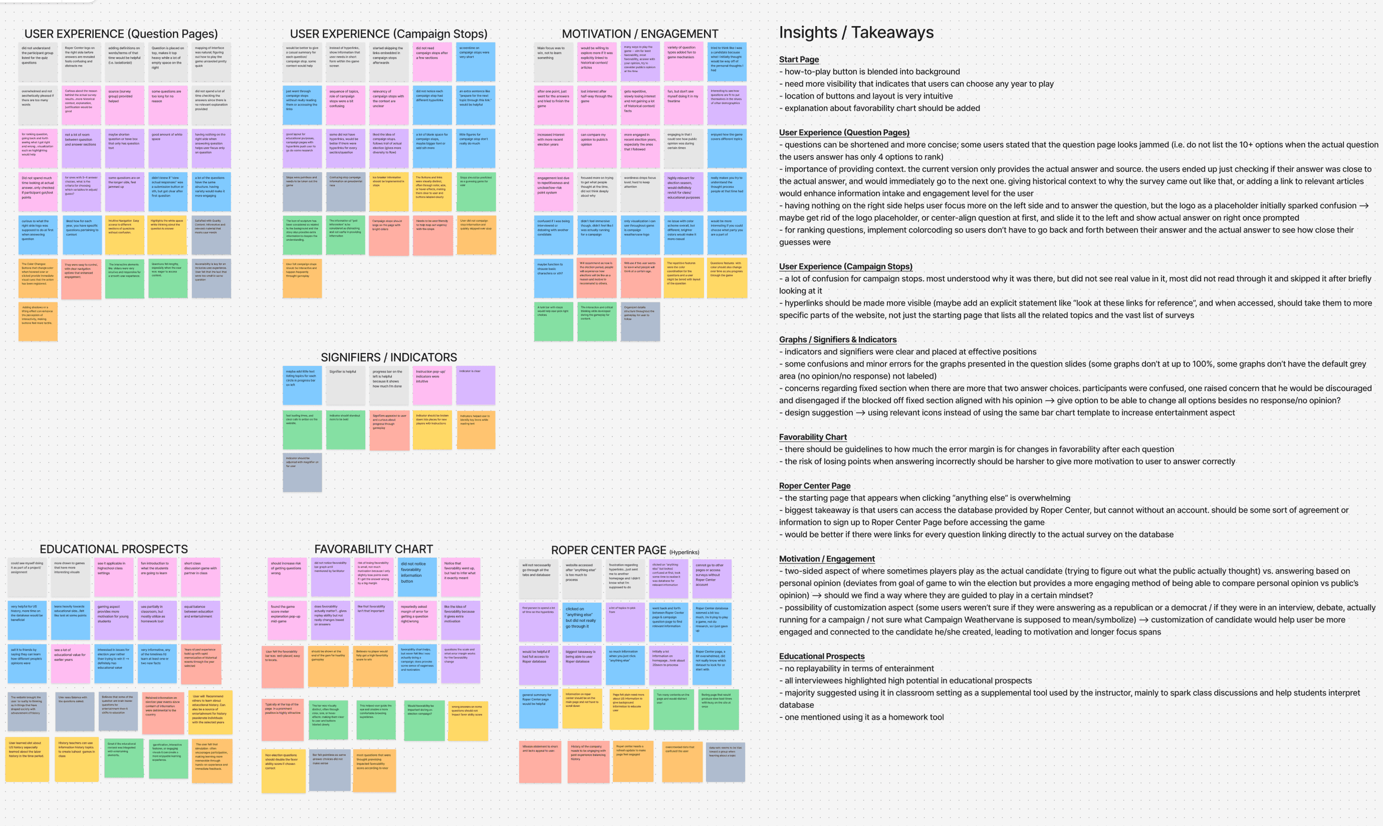
The Moment Complaints Became a Design Compass
P1
Clarity
Navigation and progress must be unambiguous.
P2
Feedback
Immediate confirmation of understanding.
P3
Motivation
Gameplay should reinforce effort, not distract.
P4
Outcomes
Design must point back to learning goals.
05 / The signature decision
A progress bar is a promise.
During usability tests, students smiled when the progress bar filled up and said, “I’m done, I’ve learned it.” Yet when asked follow-up questions, many couldn’t recall the key concepts. That contradiction was striking: the interface signaled success, but the learning had not happened. It wasn’t just a UI bug—it was a gap between appearance and outcome.
That moment reshaped how I thought about educational design. A progress bar is not just decoration; it is a promise. As Don Norman reminds us, affordances guide expectations. For Roper Center, the real goal wasn’t “finishing a task” but “retaining knowledge.” That realization led me to redesign progress as layered checkpoints with feedback and citations, turning completion into genuine understanding.
Before — filled either way · completion ≠ comprehension
After — each segment unlocks on demonstrated understanding

06 / The other decisions
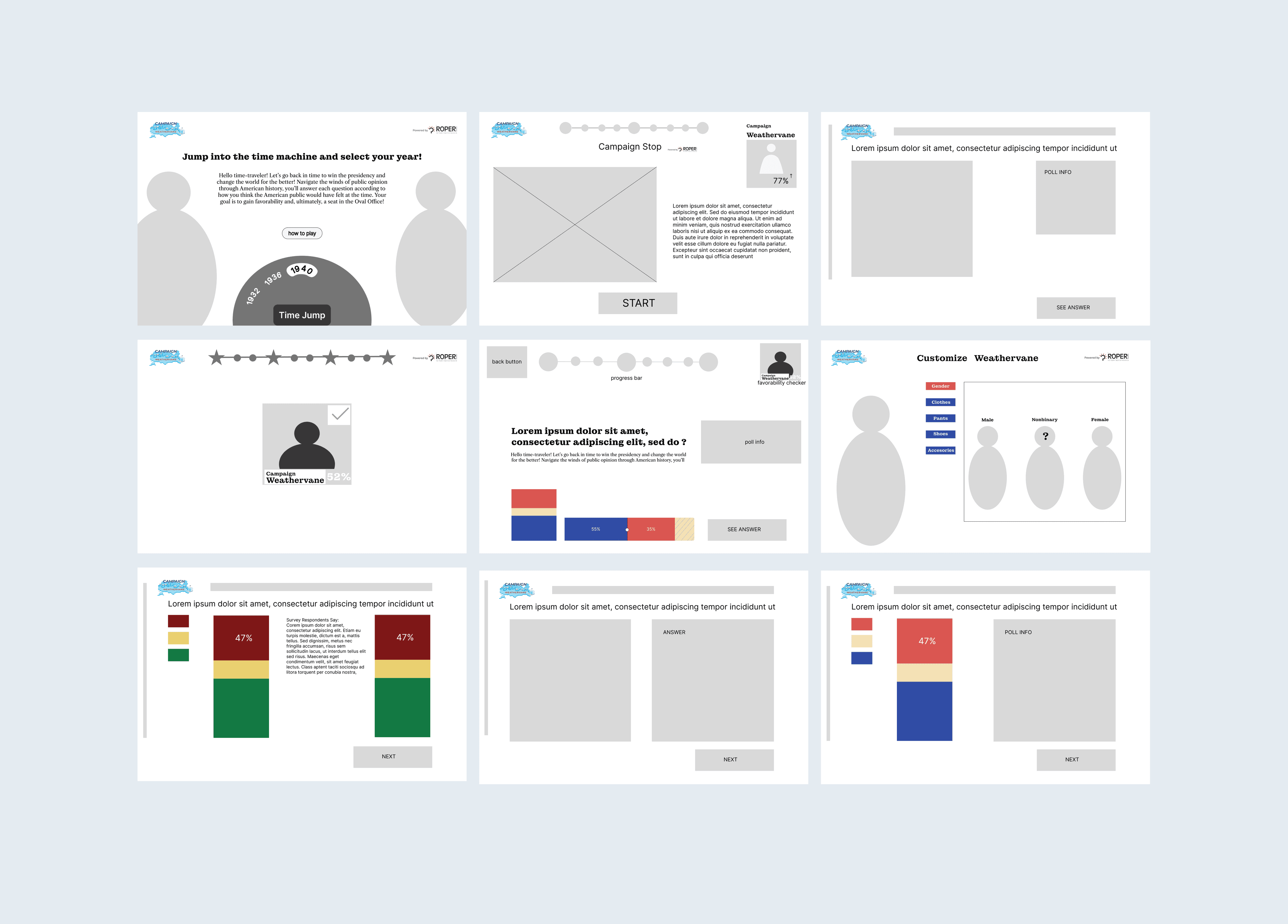
The loops that followed the checkpoints.
04
How Feedback Turned Empty Clicks Into Learning Moments
In usability tests, students said they clicked without thinking because the system never asked them to pause. I introduced immediate feedback—correct answers revealed sources, wrong ones showed hints and citations. This transformed clicks into moments of reflection, teaching students that learning wasn’t about speed, but about engaging with evidence.
05
The Day Sources Stopped Being Ignored And Started Driving Learning
Early prototypes treated citations as optional drawers, but students ignored them. I reframed citations as part of gameplay: correct answers unlocked sources, and exploring them earned small achievements. What was once a burden became motivation—students engaged with primary sources not because they had to, but because it felt rewarding.
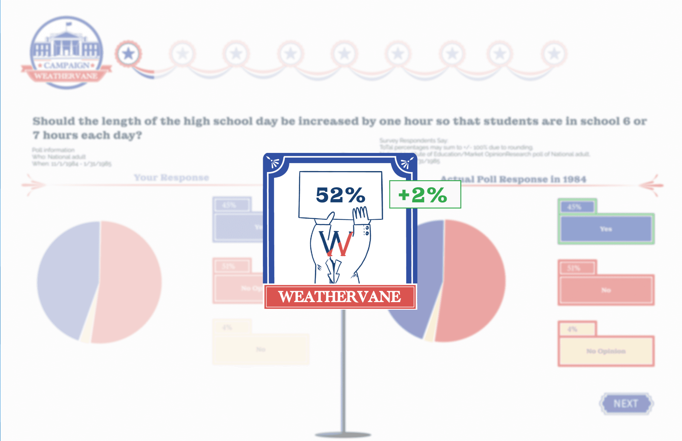
07 / Prototype walkthrough
The redesigned learning loop, from guess to evidence.
Campaign Weathervane · hi-fi prototype · fall 2024
08 / What Roper kept
Their first evidence-based UX process.
The lasting impact wasn’t any single deliverable. Every design choice traced back to a pain point, every feature mapped to a principle. The redesign didn’t just make the tool usable—it made it educational.
01
Hi-fi prototype
The redesigned simulation — checkpoints, feedback, and the reveal loop.
02
UI kit
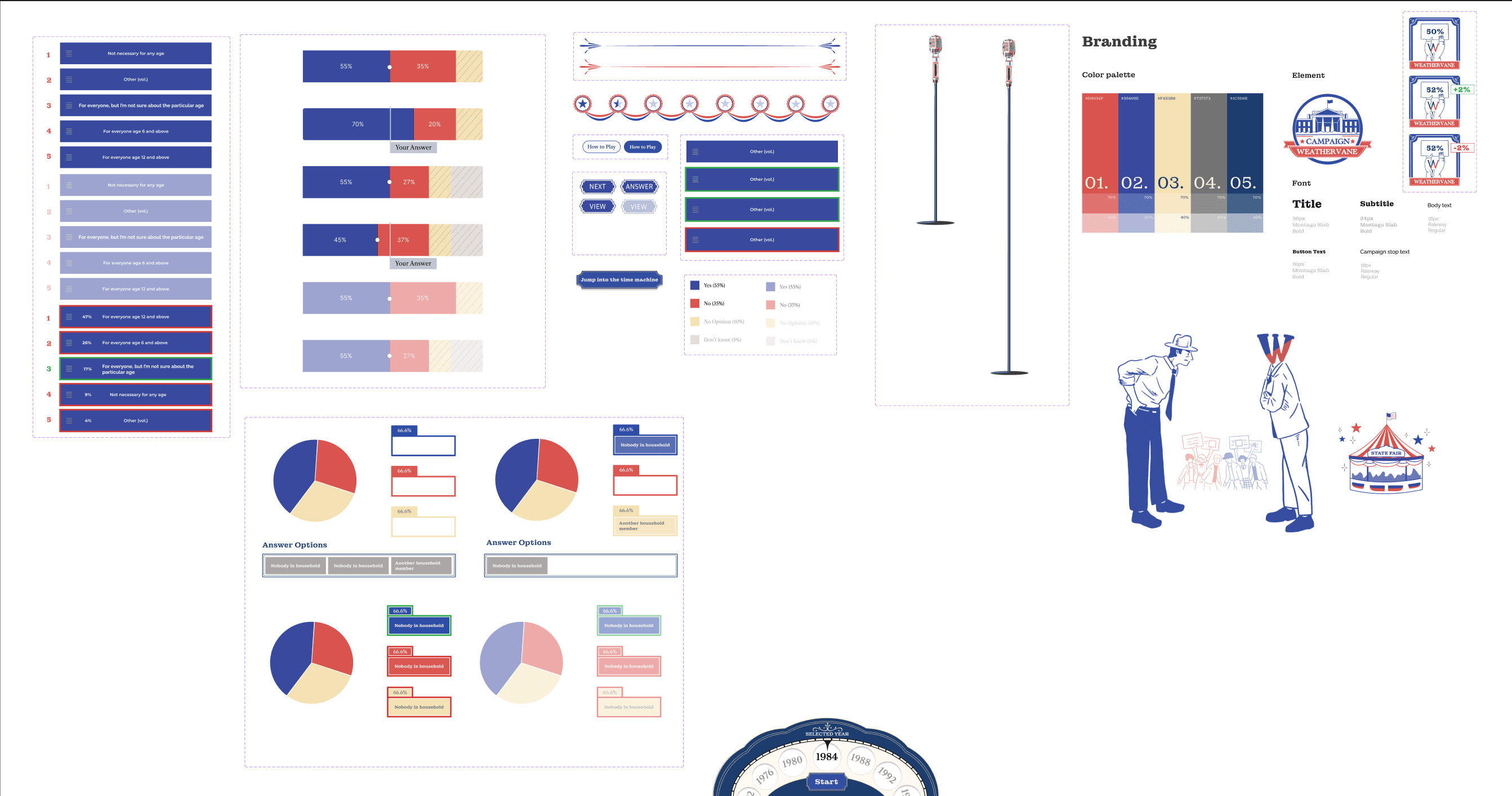
Branding, palette, type, and component patterns for the client’s team.
03
Research report
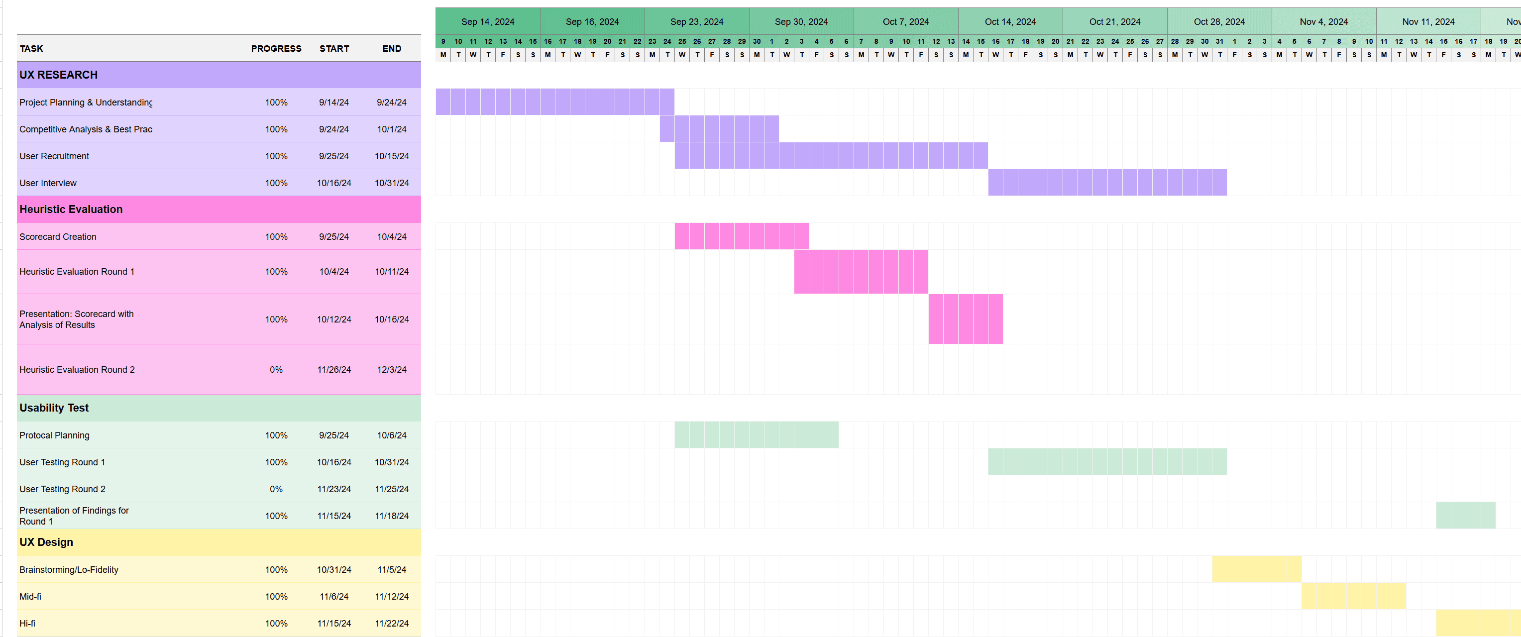
Twelve weeks of records — testing protocols, session recordings, and post-test surveys.