Product design · Design systems · Design engineering
Pulse
Pulse is an AI marketing operating system. I designed Home, Campaign, and Calendar — where its campaign cycle meets human judgment — and built the system that keeps the team, and its AI, shipping one product.
The assignment became the operating system
I joined with about a week to a pitch and one product scattered across six prototyping tools. Designing its front door meant understanding the whole loop behind it: the brand model, the 90-day strategy, the signals coming in, the performance flowing back, and the human decisions connecting them.
That work expanded into a unified application runtime, 62 canonical components, AI-readable design skills, automated consistency checks, and a React distribution layer. The outcome was not just a cleaner prototype. It was a shared way for design, engineering, ML, product, and coding agents to keep building the same product.
Two reading tracks — pick one
Part 1 · Product
A closed loop from brand model to next campaign.
1.1 · Product
Learns the brand, runs the cycle, improves the next one.
One operating loop, drawn as a workspace
Pulse is the next act of the team behind Vicino, the node-based video generation platform — an AI marketing operating system, not a content tool bolted onto a chat box. The whole product is one loop, and the map below is how it runs.
Learn once, run, learn again
First, learn the brand. Onboarding builds the model everything else runs on — profile, voice, audience, competitors — plus the visual identity, moodboard, color tokens, and asset vault the AI later draws on to produce on-brand visuals and video. Ratified as a Brand Report, it becomes Strategy: a 90-day contract of bets, positioning, and guardrails, corrected whenever the market or the numbers disagree with it.
Then, run the cycle. An approved campaign plan becomes a set of briefs; approved briefs unlock production; finished content returns for review before it enters the calendar. Calendar ships it on time, and analytics reads the results back into strategy, briefs, formats, and timing.
And never run blind. Signal watches the market daily — competitors, trends, risks, openings — and what it finds can spawn a campaign or recalibrate the standing strategy. Performance flows back from inside; strategy and the next campaign absorb both.
1.2 · My surfaces
Three pages where the cycle meets a person.
Decide, produce, distribute
I owned the design and rebuild of Home, Campaign, and Calendar — one path through the loop: decide, produce, distribute. The work started with a category teardown, not a blank canvas — how social suites, AI content tools, and content calendars handle the same jobs — and one pattern repeats across all of them: they optimize for showing everything and deciding nothing. That gap became the brief for all three pages. The rest of the product — Signal, Strategy, Analytics — appears here as their upstream and downstream.
Home decides what deserves today
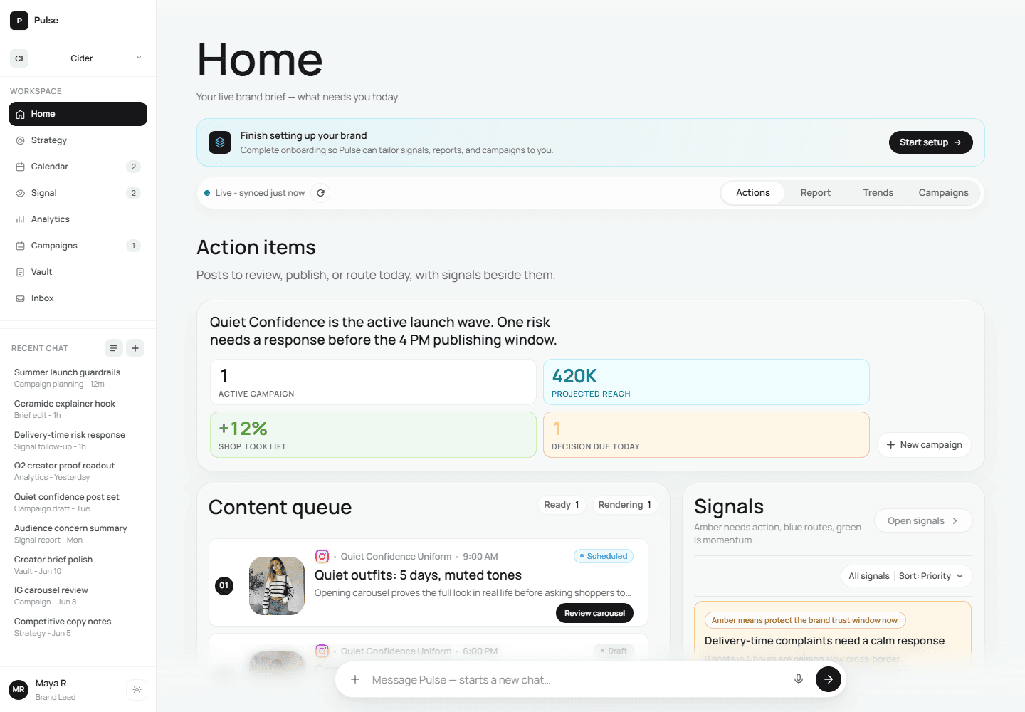
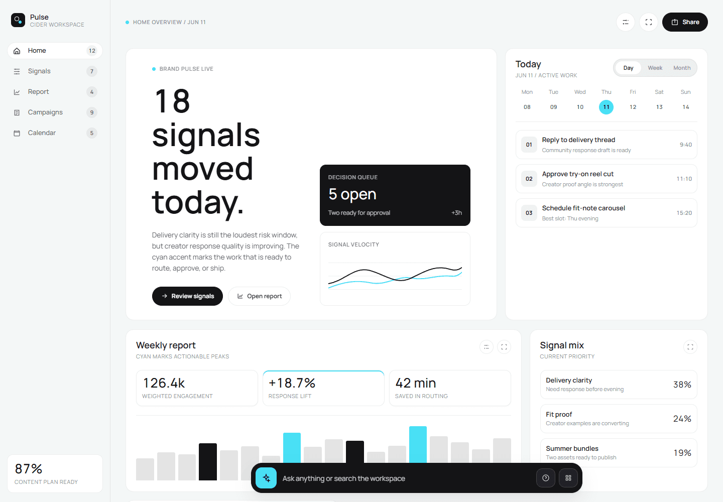
Marketing tools in this category open on dashboards — chart walls, activity feeds, follower counts — because showing everything is easier than deciding anything. Home bets the opposite way: the first screen of an operating system is the day’s decisions, not the brand’s vital signs — “your live brand brief — what needs you today.”
Three decisions carry the page. Action items lead, each card pairing the signal that explains why it matters with exactly one primary action. The content queue runs second, a live state on every item — scheduled, draft, rendering, ready. And the assistant is a persistent input docked at the bottom — “Message Pulse” starts work from anywhere — never a floating bubble that covers the work.
Campaign places the person before and after the machine
AI content tools mostly start at a prompt box and end at a wall of drafts — generation first, judgment nowhere. Campaign is built as the reverse: it starts from the 90-day contract and refuses to generate anything a person hasn’t scoped, through three gates that are real nodes in the build — the plan before spend, the brief before generation, the content before anything goes live.
The page itself is decision-first. Approvals and the production queue sit above the campaign list, and production is legible by stage: briefs, generating, content review, schedule, publish. Pulse suggests directions from the week’s signals, but a suggestion arrives as a card you adopt or dismiss — never as work already done — and Create with AI returns a structured Creative Brief as editable fields, where only approval hands off to generation. Early on spend, late on quality: that placement is product design, not paperwork.
Urban runners, 18–29, early-morning crews
City miles before the city wakes
Short-form video · street-level POV
Confident, unhurried
Natural light, muted brand palette
Calendar balances the automatic and the hand
Content calendars in this category are grids you fill by hand — where finished work goes to be arranged. Pulse’s Calendar is the control plane between production and publishing: approved work flows into the schedule and ships on time without anyone pushing it, and a person can grab any of it back — drag a post to a better slot, hold a day, reshuffle a week.
Day through month views share a single spine, so replanning never means relearning the page. Schedule health sits beside the grid, making what will ship as visible as what shipped, and auto-slotting can be overridden per item. Automation you can always interrupt is the difference between a scheduler you trust and one you babysit.
1.3 · Design language
Quiet on purpose.
Neutral first, color with meaning
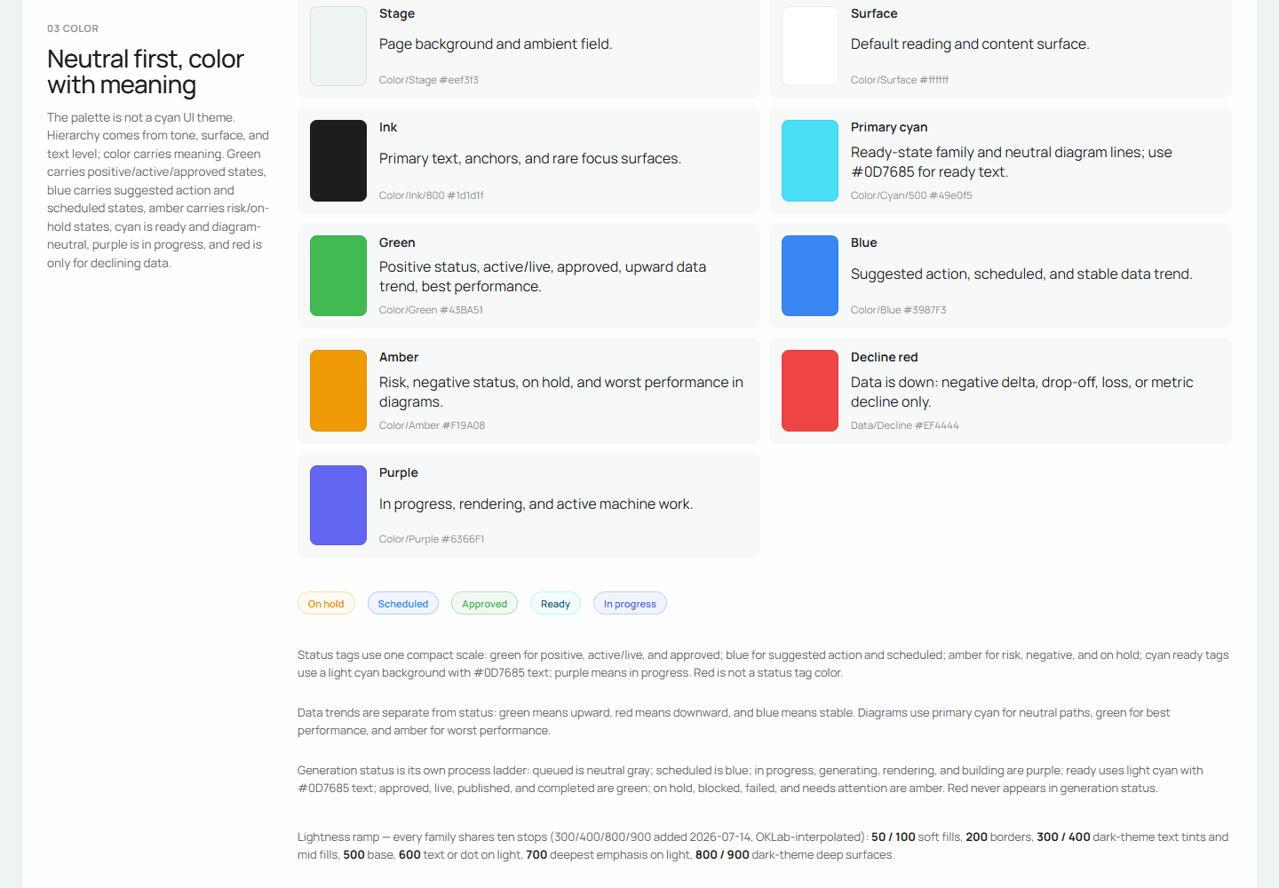
The stage stays neutral — gray ground, soft cyan light — so the work is the only thing that speaks. Color appears only when it means something: cyan for ready, blue for scheduled, amber for risk, red reserved for falling data. Learn the palette once and every screen after that reads itself. The same economy runs through the type: one face for everything, tabular numerals for data, and hierarchy built from size, spacing, and tone — never bold.
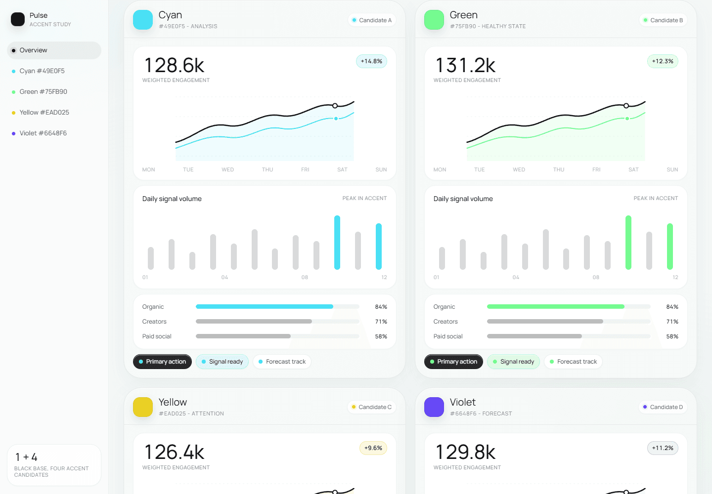
The identity had to be settled fast, and it had to survive being reproduced by AI, so I kept the rules few and wrote every one of them down. I also refused to pick the direction by taste alone: the accent candidates ran against the same dashboard side by side, and the winner had to prove itself on a full Home screen before we ratified the palette. Writing the rules down felt like documentation at the time. It turned out to be the seed of everything that follows.
Part 2 · Design engineering
The system I built so the team — and its AI — could keep building Pulse.
2.1 · Fragmentation
One product, six incompatible prototypes.
Prototypes that only looked like one product
The operating loop you just toured is six weeks downstream of a very different scene. When I picked up Pulse, everyone was iterating on the same product in a different tool: canvas frames, an AI page-builder, model-pasted HTML, screens composited from images. An early style pass kept the pages looking related, but nothing underneath matched. With a week left before the pitch we had to fold all of it into one flow, and that is where the lesson landed for me. Visual consistency is not system consistency.
2.2 · Convergence
From prototype fragments to one working product.
Betting the pitch on code
A pitch needs a flow someone can click through and record, not a deck of stills, so the designer and I decided to prototype in code and let AI do most of the typing. To keep six parallel efforts roughly aligned, we seeded a thin style pass first. It gave us a shared look. It did not give us a system, and that difference shaped everything that followed.
2.2A · The map
Home forced the whole system into view.
The front door forces the map
My page was Home, the product’s entry point, so designing it meant understanding every tab, every module, and everyone’s files. Extraction kept failing: styles were welded to pages, interactions died in transit, and much of the generated code was unreadable. The wake-up call was a single prototype file over ten thousand lines long. Nothing that size stays maintainable, for a person or, affordably, for a model.
If it’s all code anyway, hand it off clean
I started with my own file: split it, structured it, cleared the dead code. The realization underneath became the whole project. A prototype that looks right but is chaos in the code is still just a prototype — and since generating clean, structured code costs about the same as generating a mess, and it is all code either way, why not generate it in the shape engineering can actually receive, so the designer owns the real front-end result instead of throwing a picture over the wall?
So I asked the engineers a question nobody had raised yet: if design ships code, what shape would you actually accept? Their stack was React, so I rebuilt on their conventions and the handover went cleanly. To me that was the real milestone — AI quietly closing the old, contentious gap between what design draws and what engineering has to build.
2.2B · The rebuild
One app, built to receive real data.
Unify, engineer, migrate, merge
A week out, the call came to fold every prototype into one mockup and record the pitch video. I took them all: unify the surface, engineer file by file, migrate toward one stack, merge into a single runnable app. AI carried the bulk of the conversion and kept breaking things in transit, so I reviewed every page against its original and repaired every break by hand — a week of nights with a teammate.
Then the real data didn’t fit
For the pitch I wired in the ML team’s real data — and the shapes didn’t match what the screens had assumed. It was the code lesson again, from the other side: a mockup that looks finished but can’t hold real data is still just a picture. We had built the UI first and treated data as a detail to pour in later, when the honest order is the reverse — start from the data that exists, tag it, and design the chart around what it can actually give. Looking right was never the bar; being real enough for engineering to receive — real code and real data both — was. That is the gap the shared base was built to close.
2.3 · System
The visual language became a canonical system.
One canonical base, checked by machines
The fix was a base everyone shares. The look was ratified into one canonical token sheet — six semantic ramps in ten graded stops, a fixed type scale, an 8-based rhythm — layered primitives, semantics, components, so a theme rebinds one band and every component follows. Beneath it sit 62 standalone components, and every screen composes from those contracts before inventing anything page-local. Home, Campaign, and Calendar were the first surfaces to compose from it. The standard became commits rather than advice: formatting normalized the codebase, dead code came out, and dependency-free checks enforce the contracts in CI — including a contrast gate that fails the build on unreadable text.
Build the link that doesn’t exist, then delete the copies.
Stepping down from React, on purpose
I had proven I could ship the React path, and still made plain HTML and CSS the team’s prototype stack — an interim call, and one I stay honest about. Not everyone on the team can fully own engineering standards yet, and plain files meet everyone where they are: a designer and an engineer can both edit them, they export straight to Figma design boards, they preview from a double-click with no dev server to run, and they still convert cleanly into React or another framework later. A mockup a teammate can’t open might as well not exist. The floor mattered more than the ceiling — the discipline lives in the tokens and the checks, not the framework.
Preserve file:// support because designers may open this export directly.
2.4 · Operating model
The system became a way of working.
Teaching the AI the system
A library only holds if every new prototype follows it, and re-typing the rules into a chat box every time is exactly how that falls apart. So I wrote the rules as skills the AI loads before it generates or edits: maintenance skills keep tokens, components, and previews in sync, and a design skill makes new work start on-system instead of getting repaired into it. Calendar began from that baseline, and the melee never came back.
The skill is a living document
When a review catches a drift, the fix lands in the skill’s markdown, not in someone’s memory. I keep editing those files the way engineers keep tests green: each decision we settle — a token, a component pattern, a rule about states — gets written where the AI reads it before it works. That is what makes the generation quality compound: every edit raises the floor of everything produced after it. The newest waves land the same way — a chart-color canon with its own dataviz skill, motion tiers, the accessibility gate — each written into the rules first, then swept through the app. And the latest system audit was simply the three skills, run end-to-end over the library they govern.
The same rules, applied to two existing product surfaces.
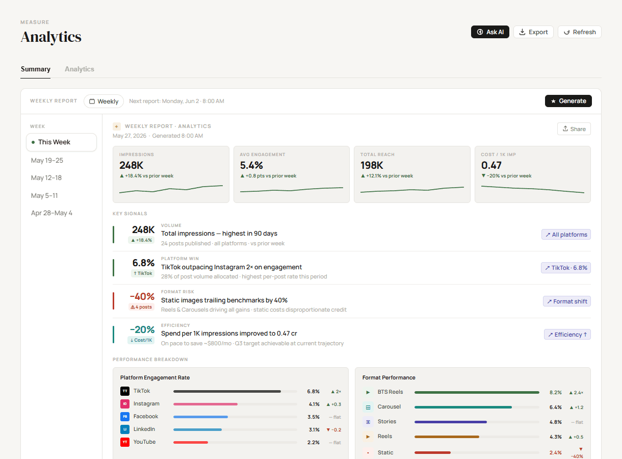
serif display · decorative color · off-system charts
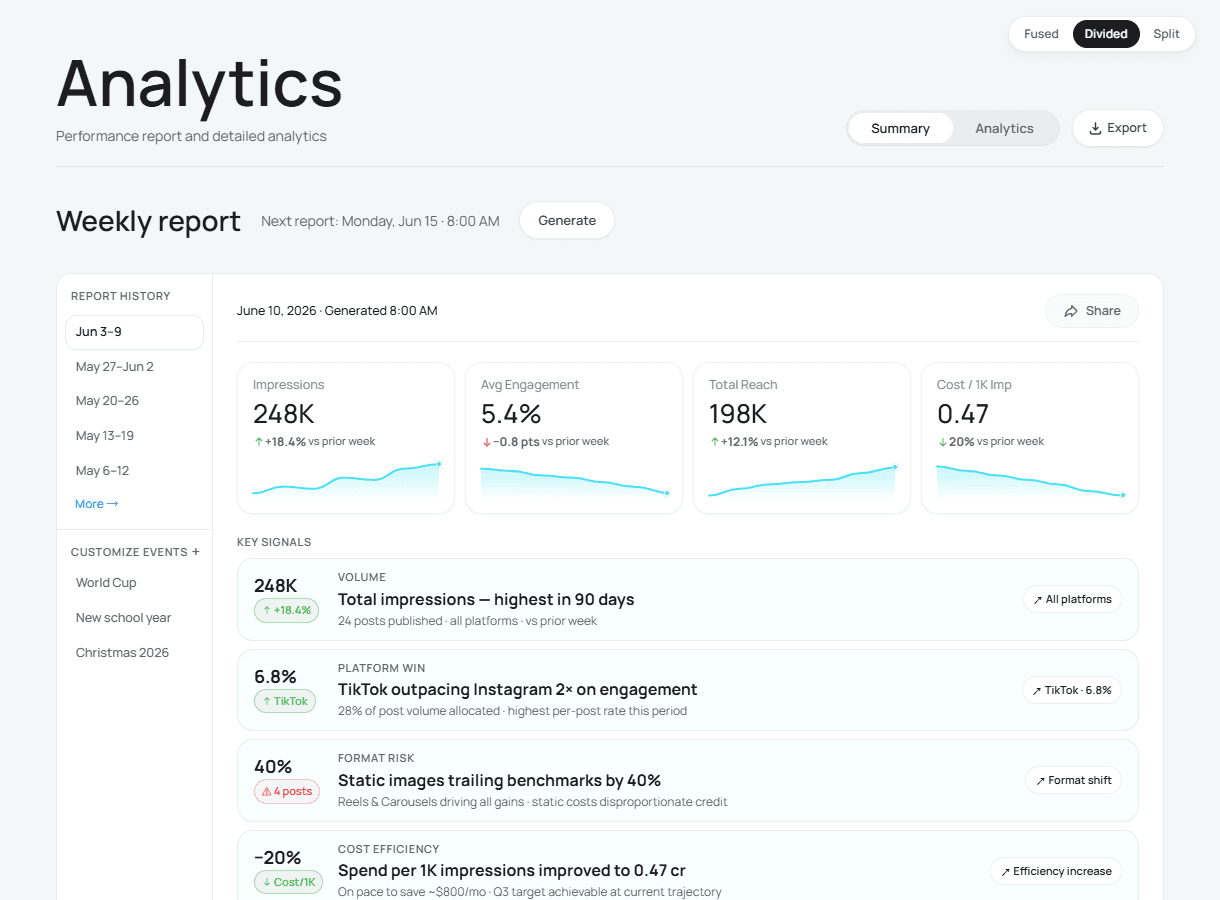
one voice · mono-cyan charts · tokenized surfaces
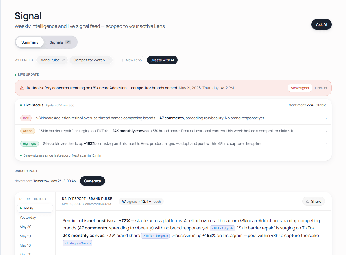
pink alert · bespoke pills · one-off chips
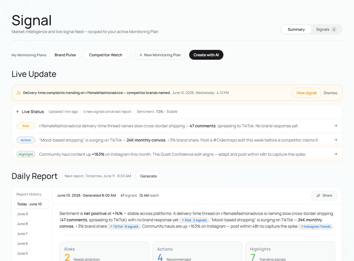
amber = risk · tokenized controls · one chip scale
2.4A · Interfaces
One source, several ways to use it.
A surface for each side of the table
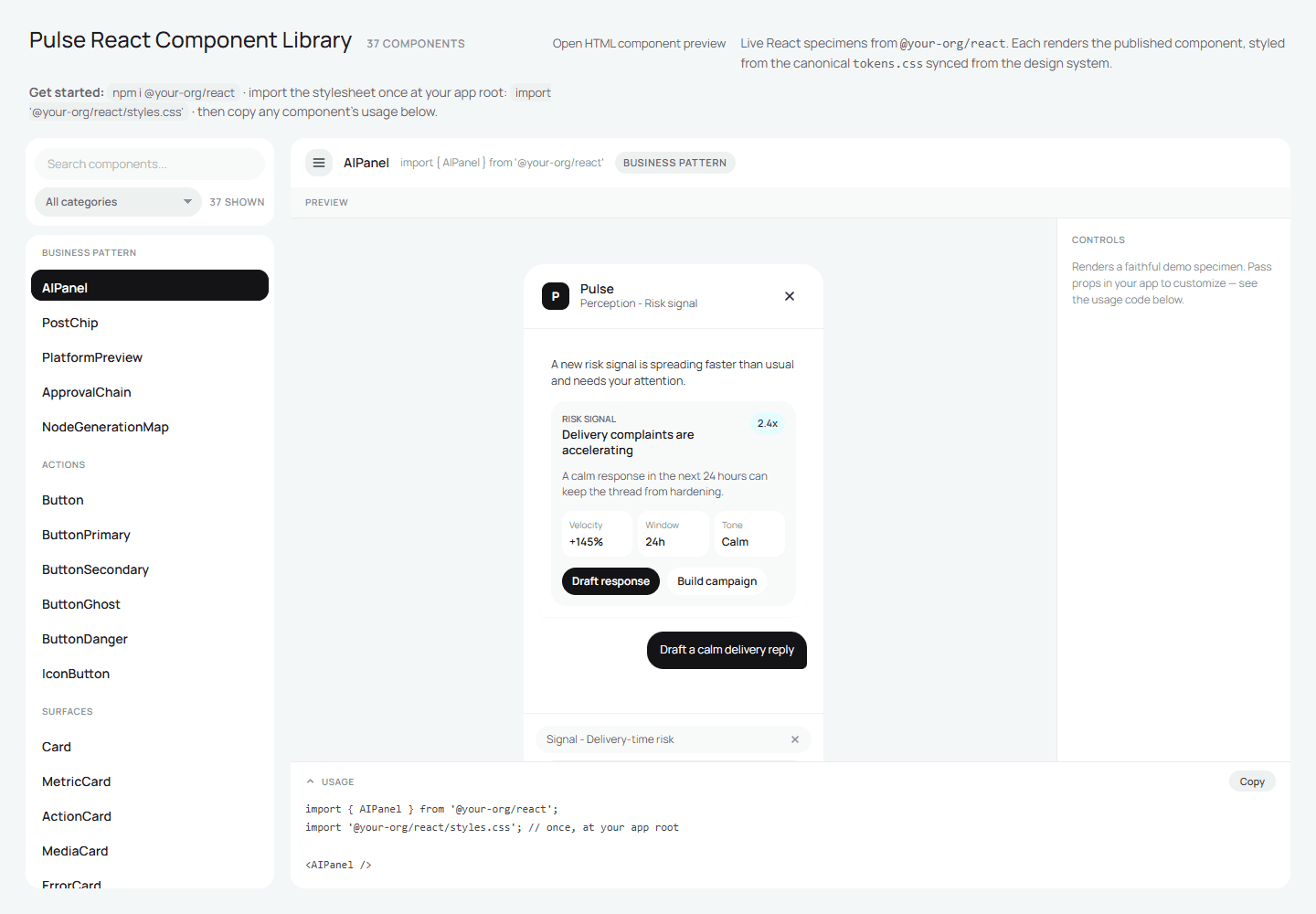
I grew a reading surface for each side of the table: a live component browser that renders every component and state from its standalone source, and a sliced, deliberately non-interactive Figma board built purely to be imported, so code UI flows back into design review. The handoff is not a snapshot either: when the system changes, a sync pass carries the decision back out to the designer surfaces.
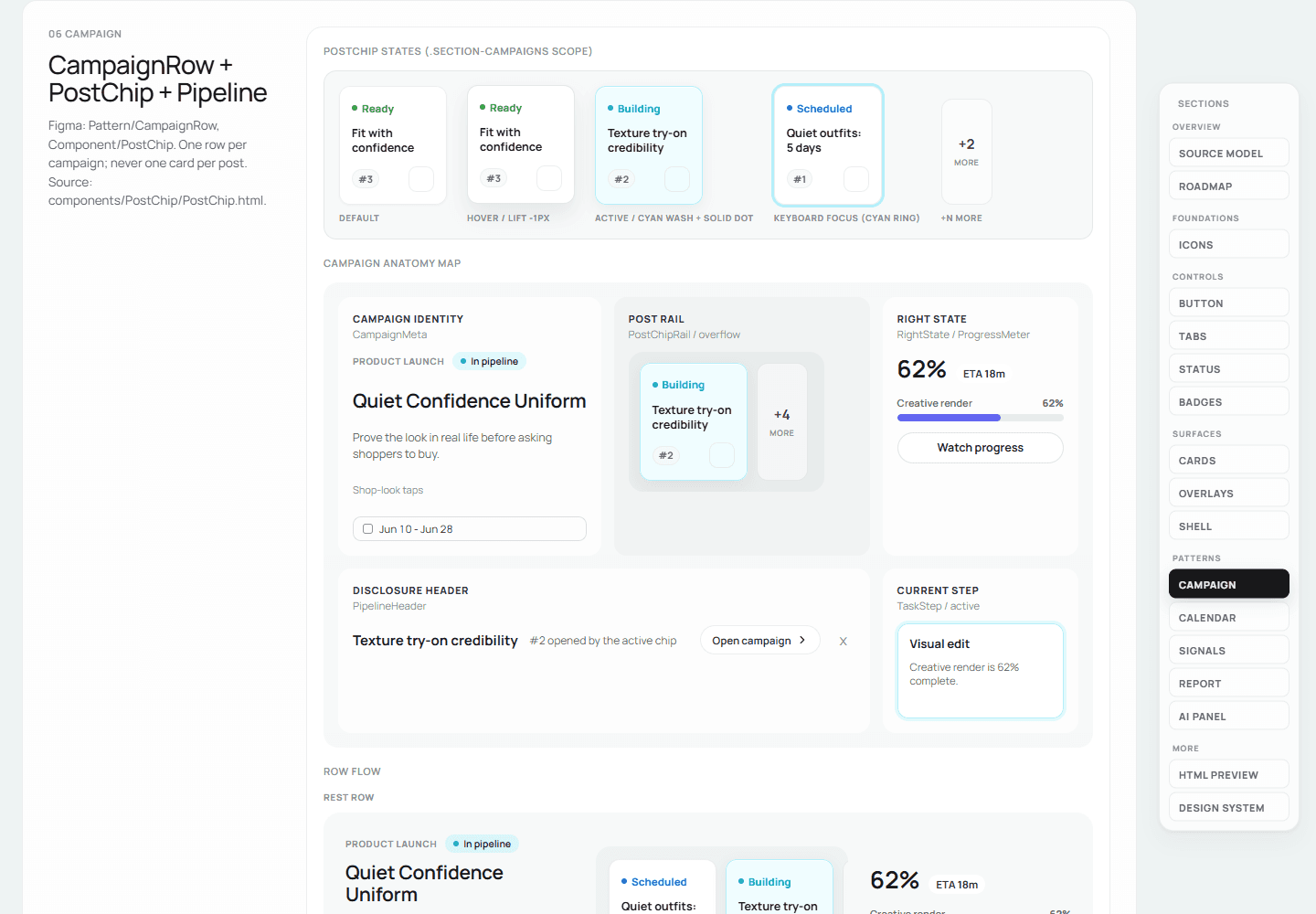
Buttons
One control contract — four intents, each with its own busy and landed feedback.
From preview to infrastructure
The HTML library stayed the source of truth. Separately, and later, a teammate re-migrated it into a typed React package on the team’s private registry — a distinct build that copies the canonical CSS in so the package can’t drift from its origin, then a CI job publishes that package and deploys its playground. The playground goes past looks: you feed a component data and watch it hold. That was the thing the melee had been missing — not talent, but an interface between the people who had to work together.
2.5 · Proof
The same page before and after the system.
Rebuilding a vibe-coded page, step by step
The clearest proof of all this is the Campaign page. It reached me as a teammate’s quick, vibe-coded prototype — one four-thousand-line HTML file, styles inlined, images pasted in as data, no system underneath. It looked like a product and behaved like a draft.
Over about two and a half weeks I rebuilt it on the base, a commit at a time: I pulled the status tabs and badges out as real components, reshaped the flow from a flat Campaign Library into a decision-first Overview — what needs your approval and what’s mid-production, with the assistant proposing directions from the week’s signals — added the plan-diff gate and the approval chain, and finally let it consume the design-system components directly. Same brief; a real product. A picture became something engineering could receive and a designer could keep owning — which is the whole point.
The quiet is the point too. Generated UI gives itself away in small tells, and the base forbids every one of them — so the more of the page the AI writes, the less it reads as AI-written. Quality stopped depending on who, or what, typed the code.
held by tokens, skills, and the CI checks — not by taste
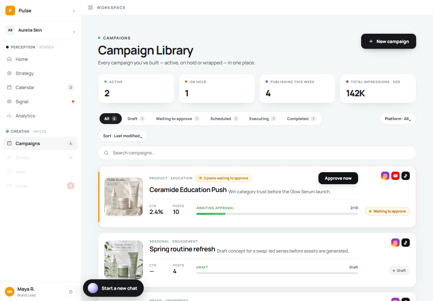
one 4,000-line HTML file · styles inline · images as base64 · no system
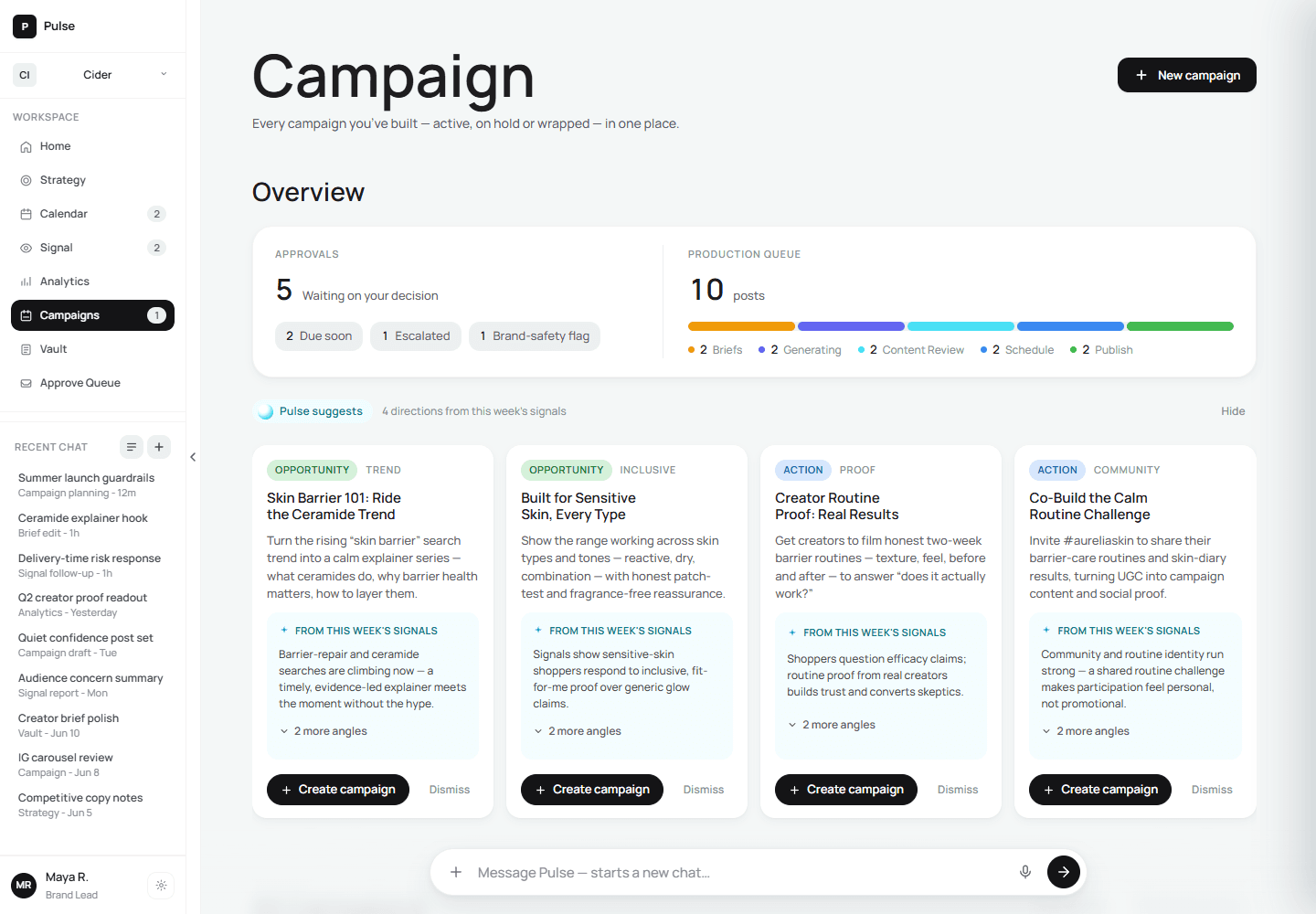
shared tokens · 10 CSS + 15 JS modules · 3 DS components · 207 commits, ~2.5 weeks
Reflection
Pulse runs a system for every brand — I built the system that runs Pulse
Pulse’s promise to a client is a system that keeps running: learn the brand once, and every cycle after — strategy, campaigns, publishing, performance — leaves the next one smarter. The deeper work of this internship was giving Pulse the same property on the inside: tokens instead of taste, components instead of copies, one runtime instead of parallel demos, and written rules the AI loads before it works — so every review, like every campaign, raises the floor of whatever comes next.
One decision stayed constant through both loops: AI can draft, schedule, and learn, but a person releases to publish. The system made the team faster; the human gate kept that speed accountable.