Page no. — 01Nyma
Platform Brand & Product System2025 – 2026
NYMA
Nyma was not a rebrand layered onto a finished marketplace. As the only designer, I rebuilt its design layer across brand, product, and implementation—then codified the system so it could carry the platform from web into mobile.
At a glance
- One platform language across brand, product, and interaction
- 30–40 core web surfaces redesigned within the system
- Design and implementation rules codified in the front-end repo
17operational brand-system pages
Project Summary
Nyma is a social resale platform for designer, luxury, and vintage fashion. Its commerce architecture worked when I joined, but brand, product aesthetic, interface logic, and implementation rules did not yet form one platform — so the work became rebuilding that layer end to end: a platform idea around continuity, one visual and interaction grammar for the core web experience, and a coded framework the team can carry into mobile.
A working platform without a coherent design layer.
The commerce worked. The platform did not yet speak as one
I joined after the hard plumbing was done: marketplace and auction architecture in place, a website already live. But the brand rationale, product aesthetic, interface logic, and implementation rules had developed as separate decisions.
Nyma was also more social than a listing board: people comment, save, and follow around the pieces. My scope became the missing design layer—one platform language the brand, product, and two-engineer team could all build from.
Thread became a platform principle, not just a brand story.
From a name to a way the platform should behave
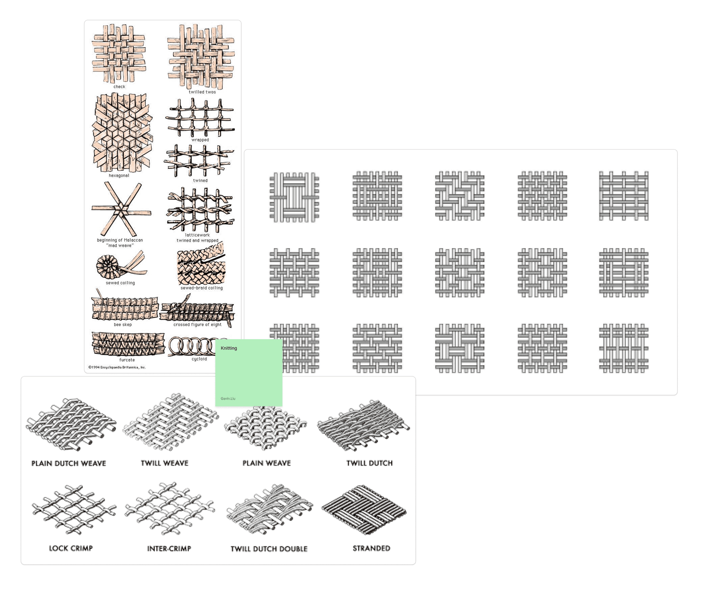
Researching Nyma led me to νήμα—Greek for thread. It gave the name more than a story: garments move between owners, value circulates, provenance accumulates, and a community forms around what each piece carries forward.
That made continuity the platform thesis. The brand had to feel archival rather than promotional; the product had to make history, condition, trust, and relationships visible; the system had to hold all of it together.
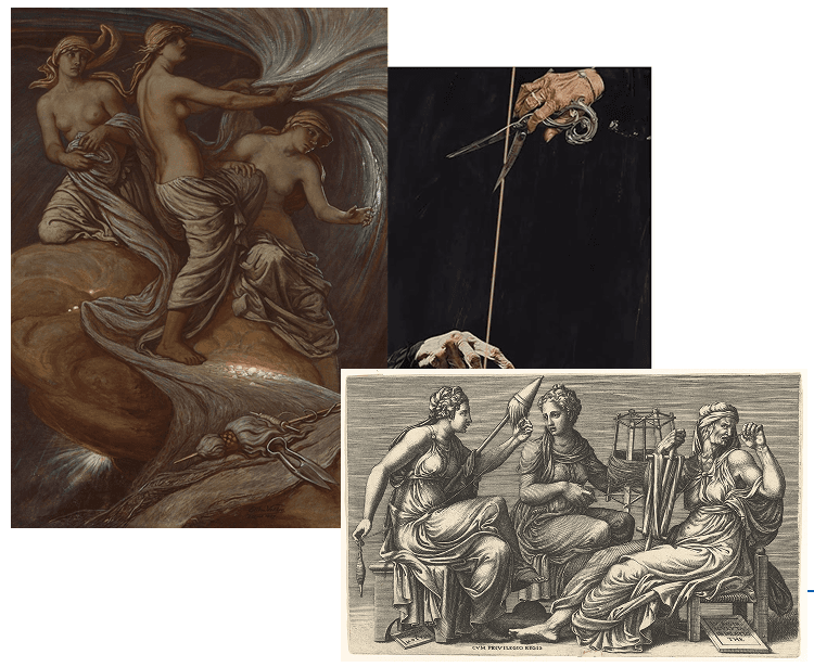
/ˈni.ma/ — Greek: “thread; yarn”
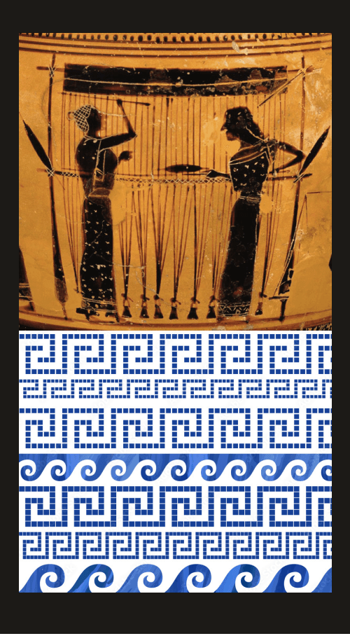
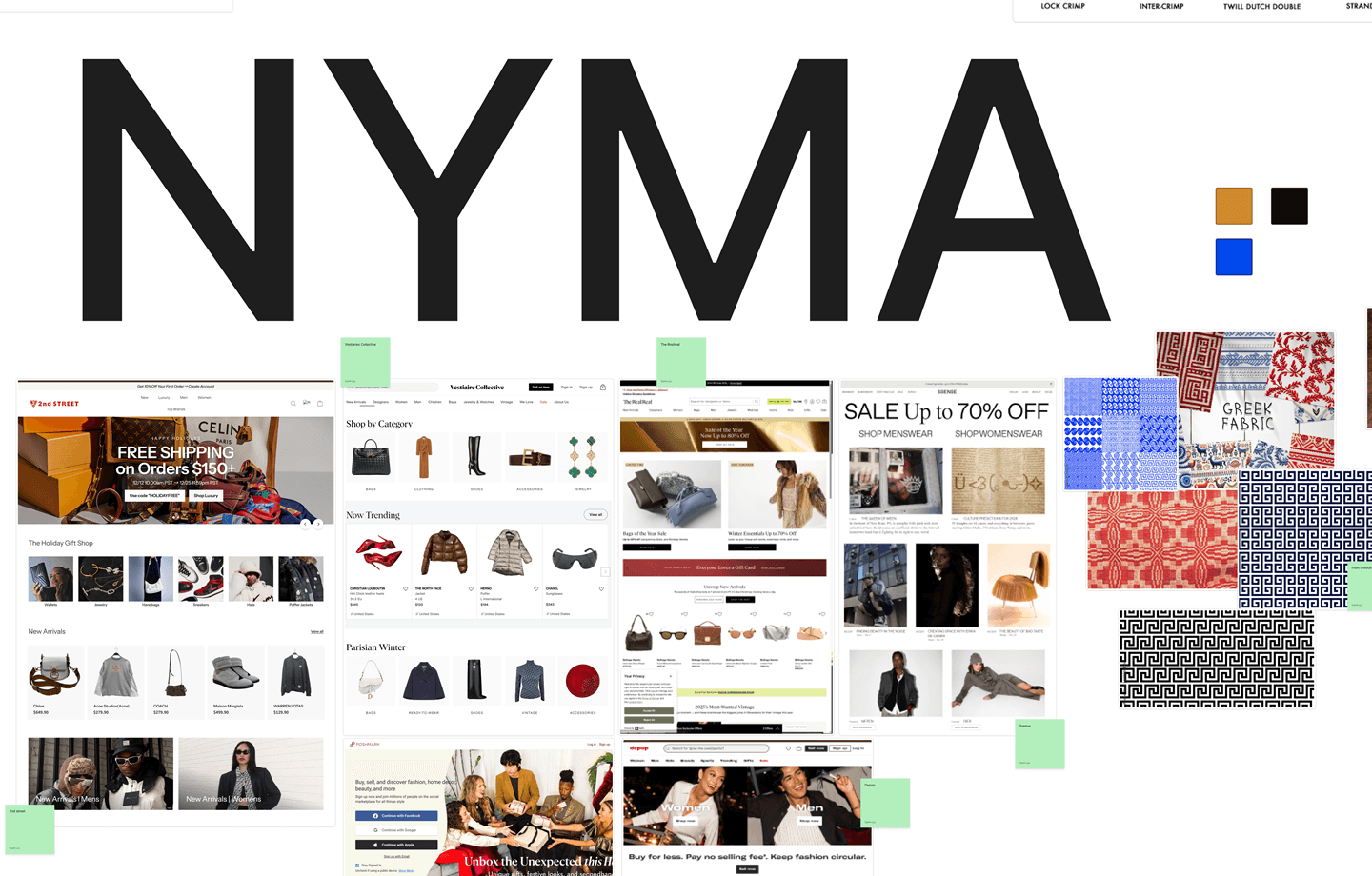
Testing which expression could carry the thesis
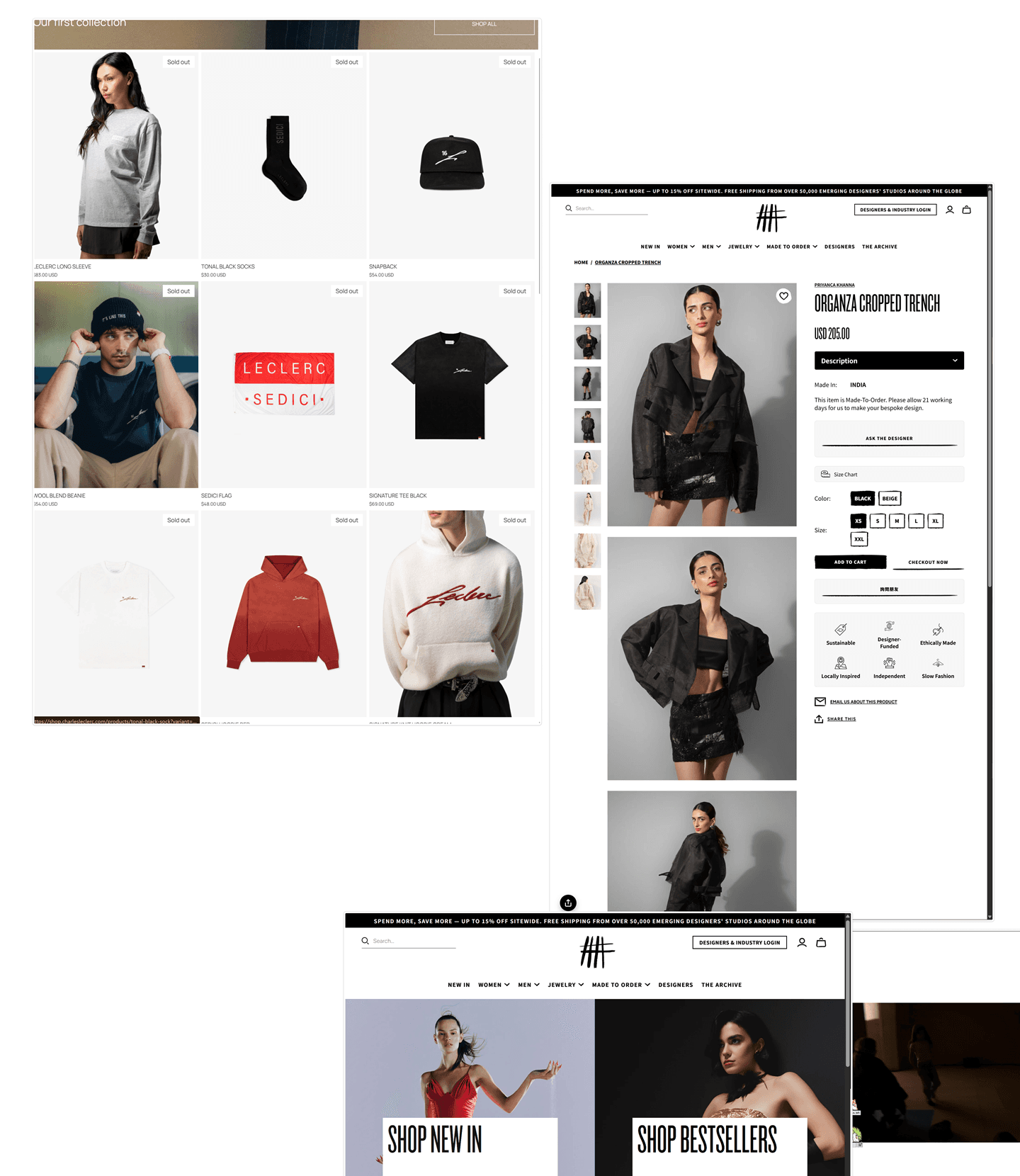
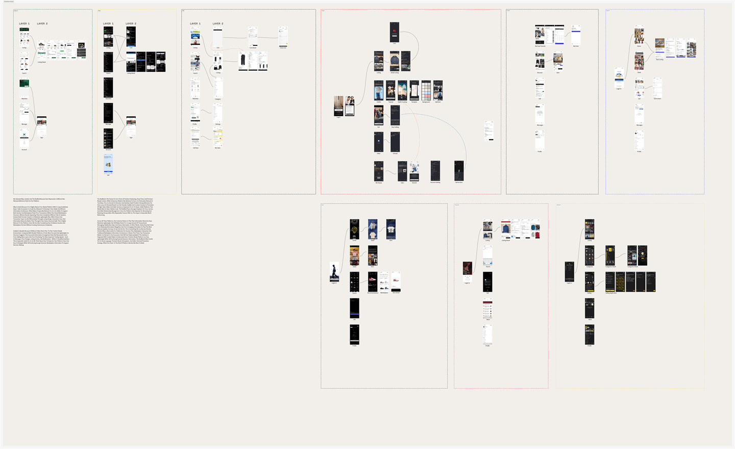
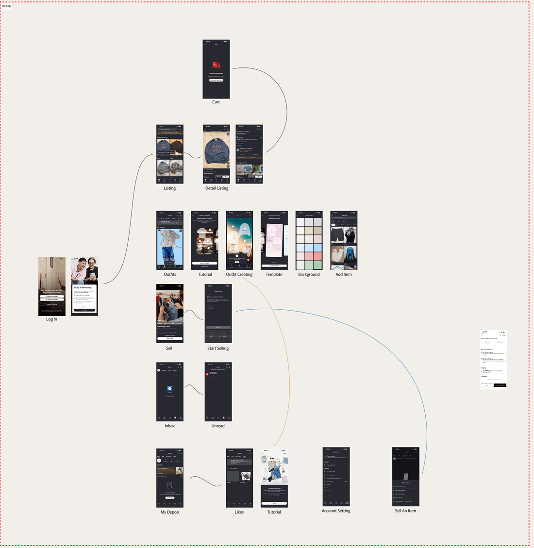
I mapped how secondhand platforms framed value—editorial, archival, transactional, or fashion-forward—then used moodboards and AI-assisted studies to compare those positions quickly.
AI widened the option space; it did not choose the direction. The deciding question was whether each concept could support Nyma’s full product: luxury and vintage, community and commerce, expressive imagery and repeatable interface rules.
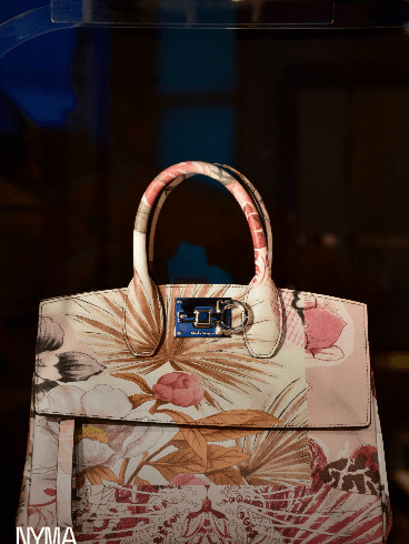
Reads like a catalogue raisonné — numbered, provenanced, quiet. The system recedes; the objects carry.
lot numbersconditionprovenance
closest to the thread — this is the structure that shipped
One design grammar for every wardrobe.
A brand system that governs product decisions
The manual was not a style guide detached from the product. It defined what stays constant, where variation is allowed, and how brand choices shape interface behavior. Clarity, reduction, and structural consistency became operating rules.
That shifted the identity from a set of assets into a shared decision framework. A founder, designer, or engineer could use the same logic to judge a new page instead of interpreting the brand from scratch.
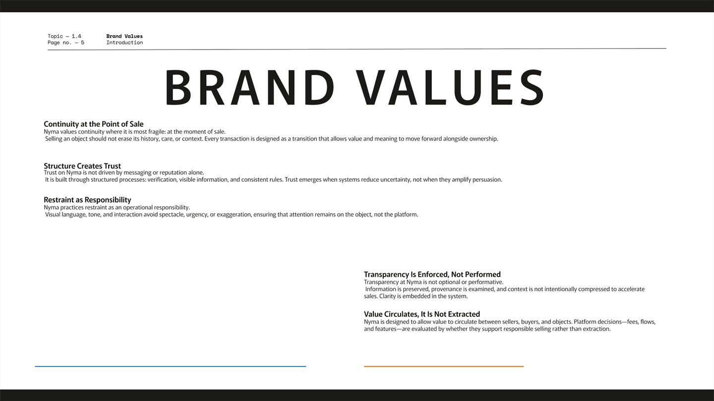
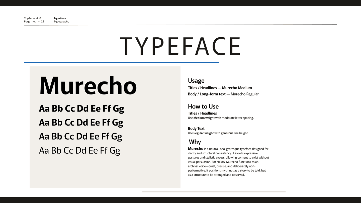
Quiet enough to receive every wardrobe
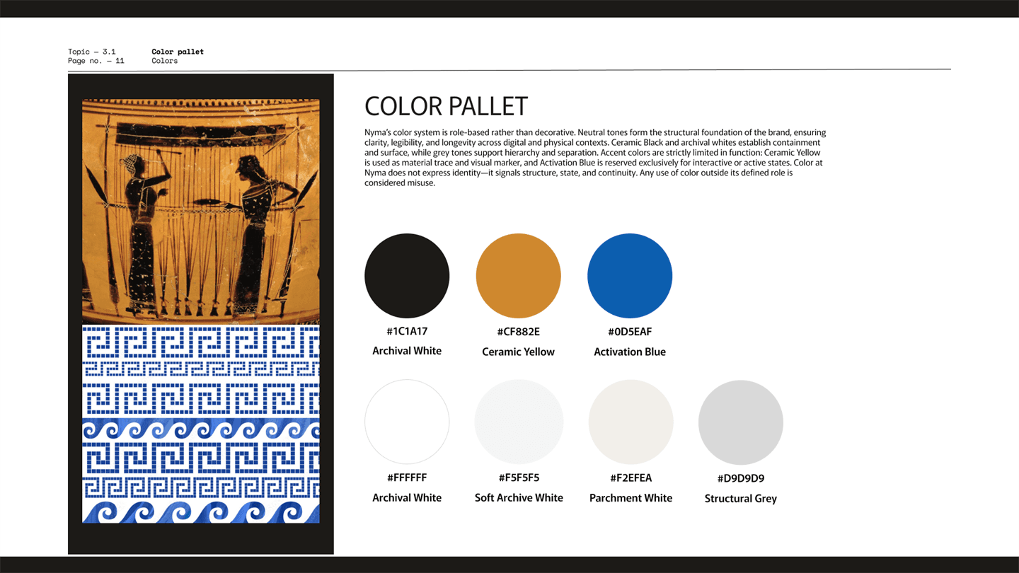
Color carries roles, not decoration: Ceramic Black contains, archival whites surface content, Ceramic Yellow leaves a trace, and Activation Blue marks interaction. Type stays thin and precise, with mono reserved for system data.
Restraint was not aesthetic minimalism for its own sake. The same shell had to hold a couture archive, a designer drop, and worn Levi’s without restyling itself. The quieter the system, the more varied the wardrobe it could receive.
Activation Blue #0D5EAF
Interactive states exclusively — the bid action, nothing else.
“Any use of color outside its defined role is considered misuse.” — brand manual, 3.1
The design language became the product.
Applying one system across the platform’s spine
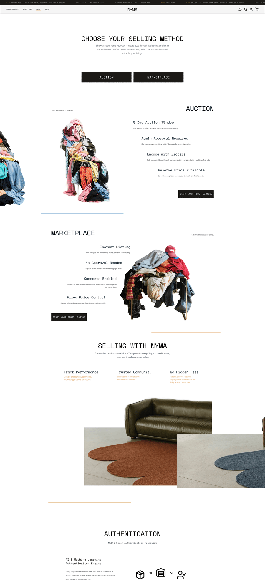
With the language in place, I redesigned the core web experience by hand in Figma: marketplace and auction surfaces, listing and seller flows, onboarding, profile, messaging, orders, and the social layer around each piece.
Across those flows, the work was less about making each screen distinctive than making the platform recognizable as one system—the same hierarchy, pacing, components, and interaction logic across very different tasks.
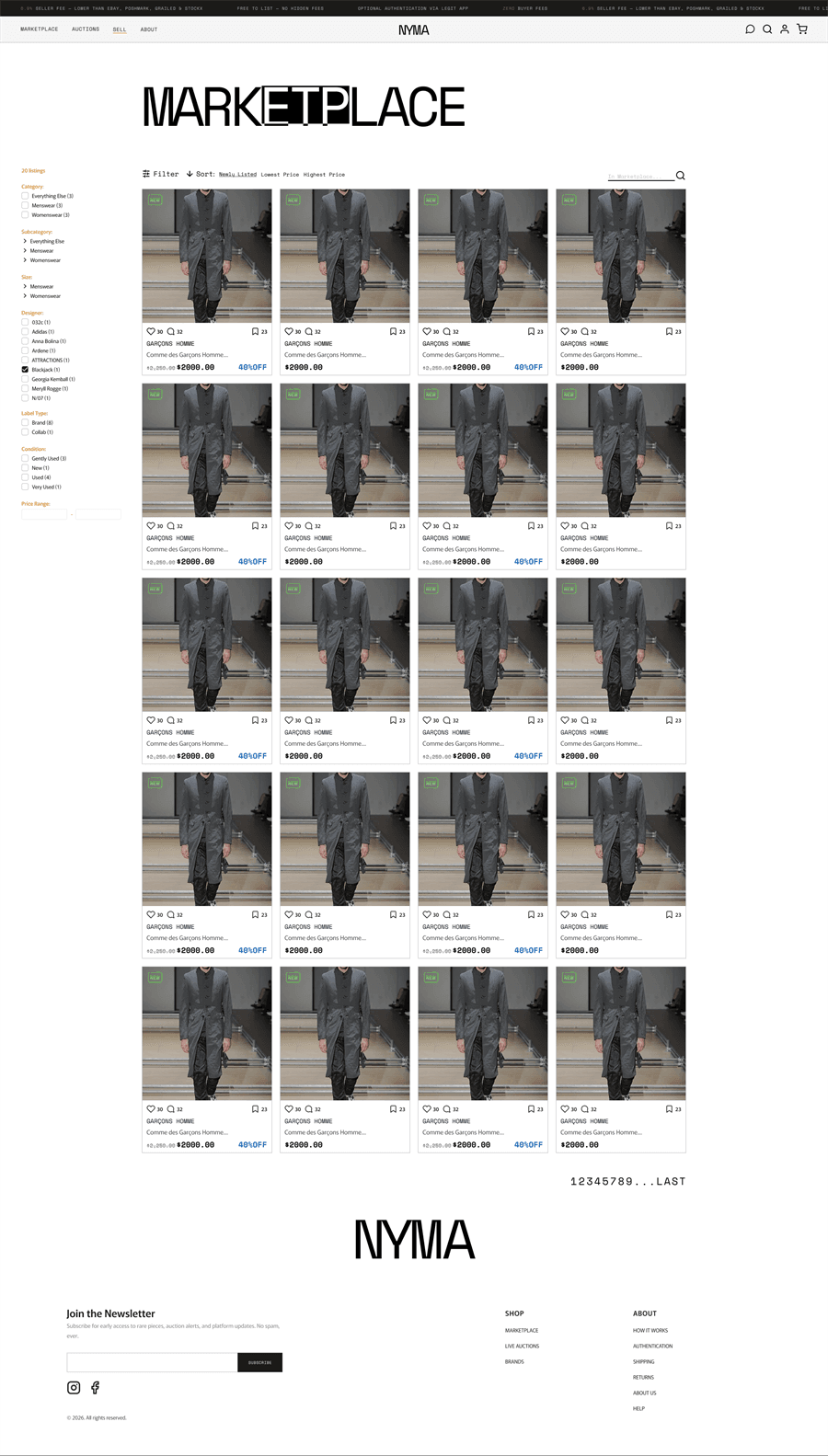
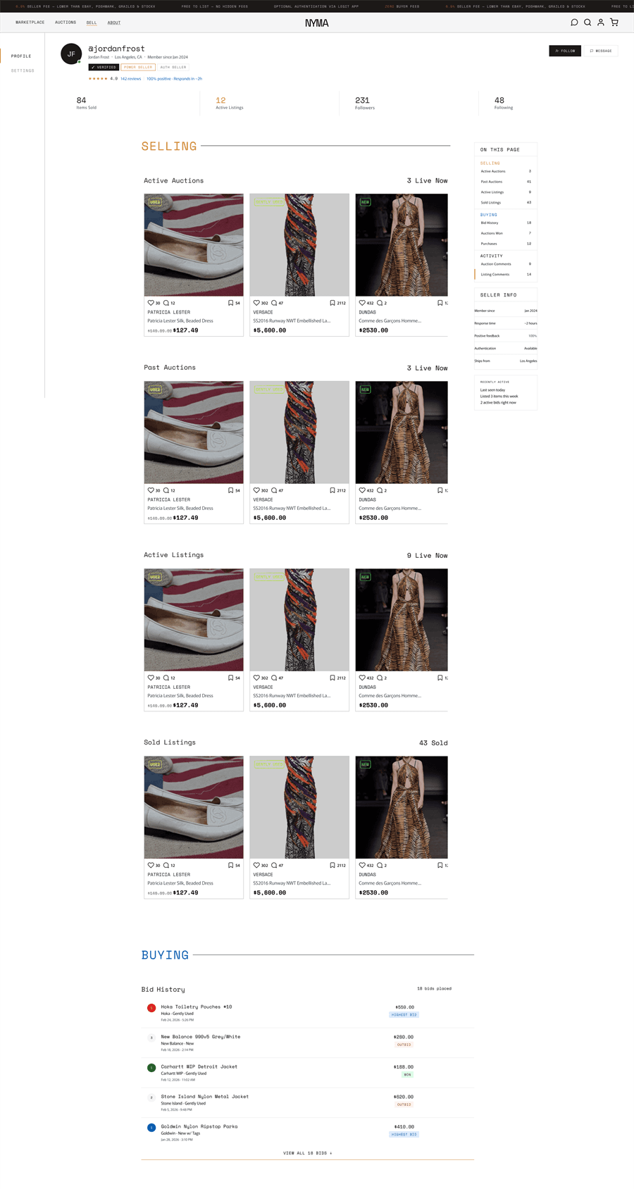
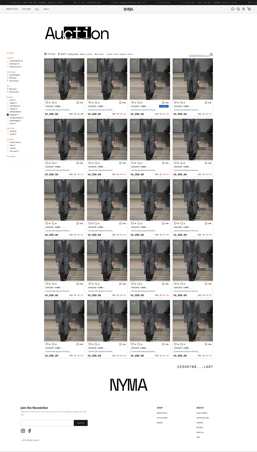
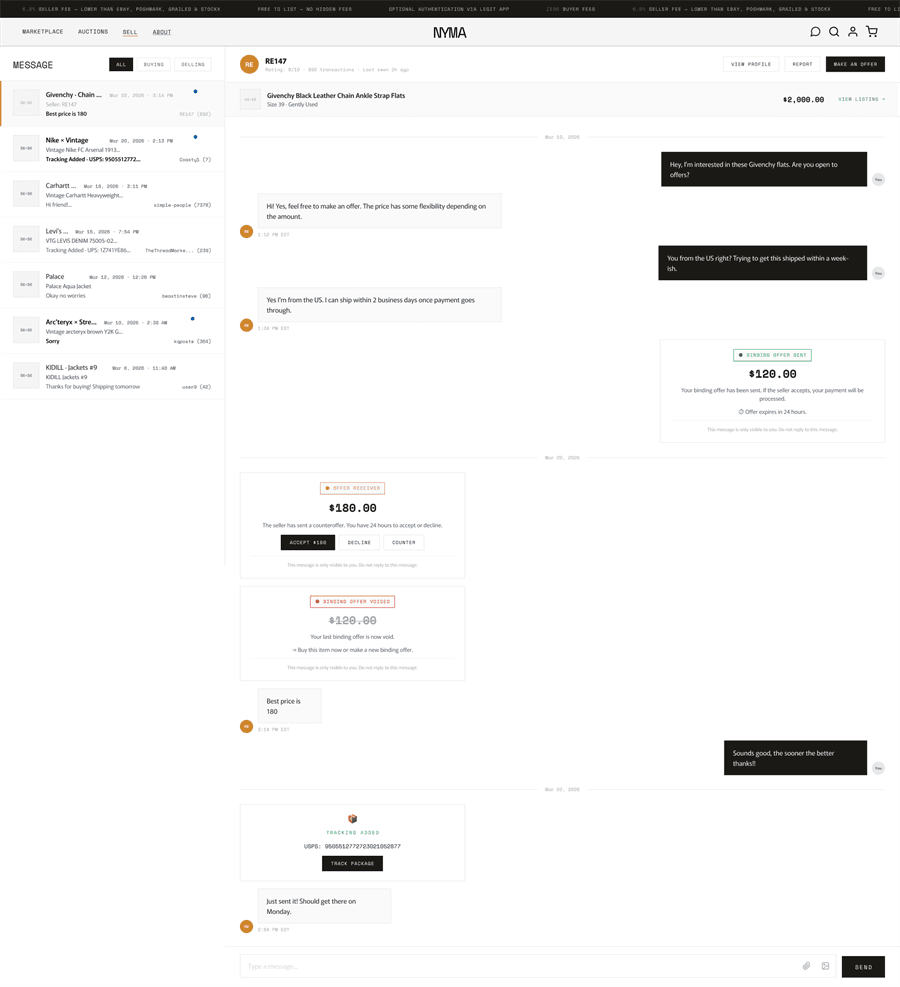
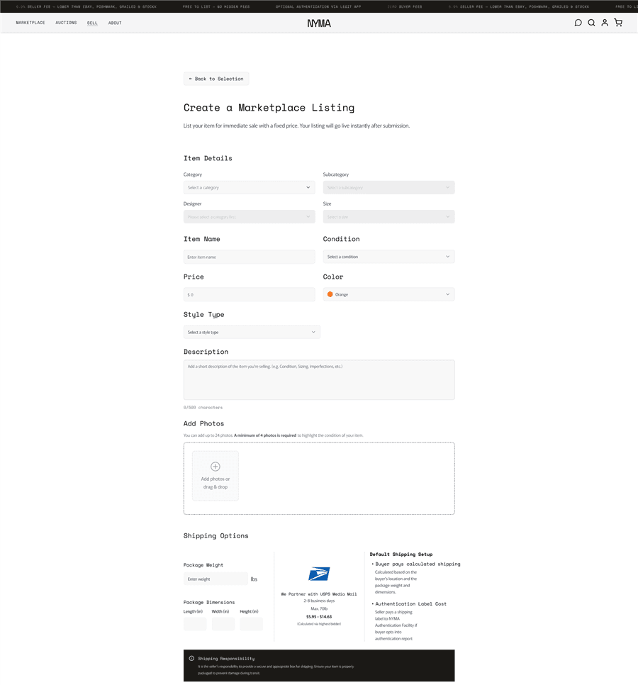
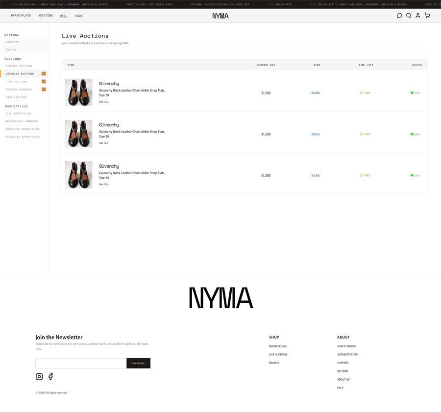
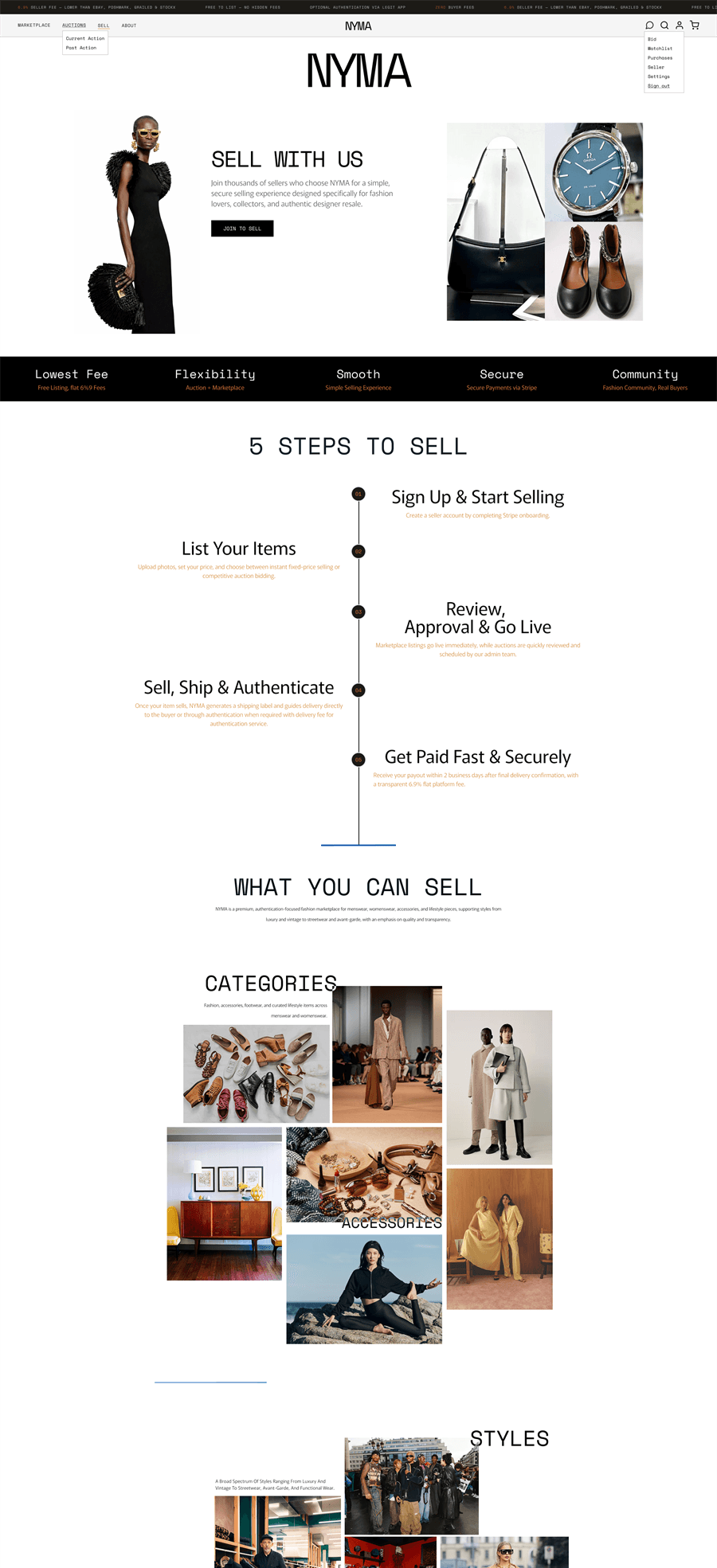
Specific without becoming exclusive
Fashion resale needs imagery to make inventory feel alive, but Nyma had no content library. I combined licensed and public-domain references with AI-generated atmosphere, using generation to expand the world without deciding the product.
Every choice was tested across three unlike wardrobes: luxury, designer, and vintage. Minimal structure let the objects lead; editorial pacing gave the platform a voice. The system had to feel specific without becoming exclusive.
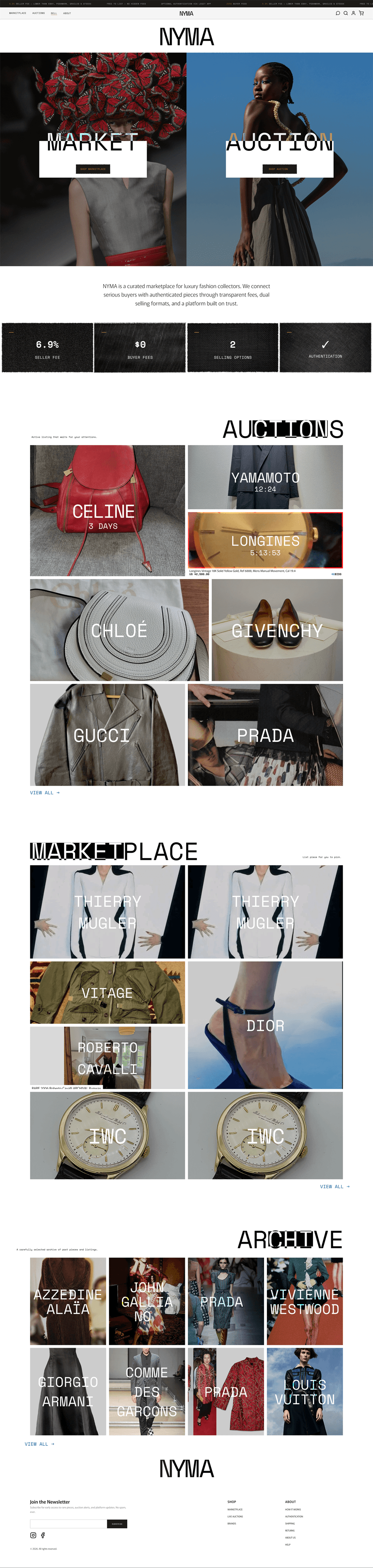
the collector gets ceremony — lot number, stamp, reserve — from the same quiet shell
The design language became an implementation framework.
The repo became part of the design surface
Nyma did not need a heavy enterprise design system. It needed a small set of rules the product could not quietly drift away from: layout, type, spacing, component behavior, and reusable patterns written into the front-end repo.
Codifying those decisions changed the deliverable. I was no longer handing engineering a collection of screens; I was giving the team a framework that could reproduce the same product logic on the next surface.
around again — the next surface
One loop between visual judgment and implementation
Figma remained the place for visual refinement, but it stopped being the only source of truth. I moved between Figma, Claude Design, Claude Code, and the repo, using each change to update the shared system rather than patch one screen.
AI accelerated generation and translation only after the framework was explicit. With stable rules, it could extend the product; without them, it produced more interpretations. The leverage came from the system, not the prompt.
One system carried the platform from web into mobile.
A framework the team could extend without starting over
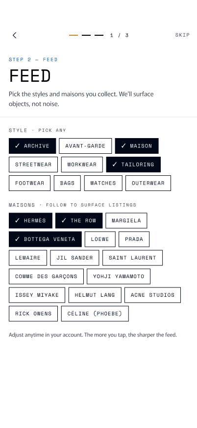
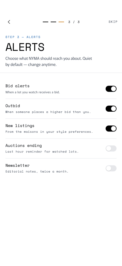
As the team began the mobile build, I used the same framework to prepare starting directions, connect the roadmap to competitor research, and assemble a working prototype that combined the new flows with Nyma’s existing design rules.
The point was not to predict every mobile screen. It was to give two engineers a coherent base for the next decision: the same brand logic, interaction grammar, and components adapted to a new surface without starting over.

 REGISTERSIGN INOR CONTINUE WITHBy continuing, you agree to our Terms & Privacy.
AUCTIONS
42 LIVEWhat changed my practice
When the brand became a framework for building the platform.
The turning point was not finding a story for the name. It was watching the same idea survive translation: from continuity as a brand principle, to color and type rules, to product flows, components, and finally code.
I would bring visual critique in earlier and codify from month one. The framework built near the end would have made every earlier decision faster to test, easier to share, and less dependent on one designer’s memory.
Brand · product · implementation — one system